
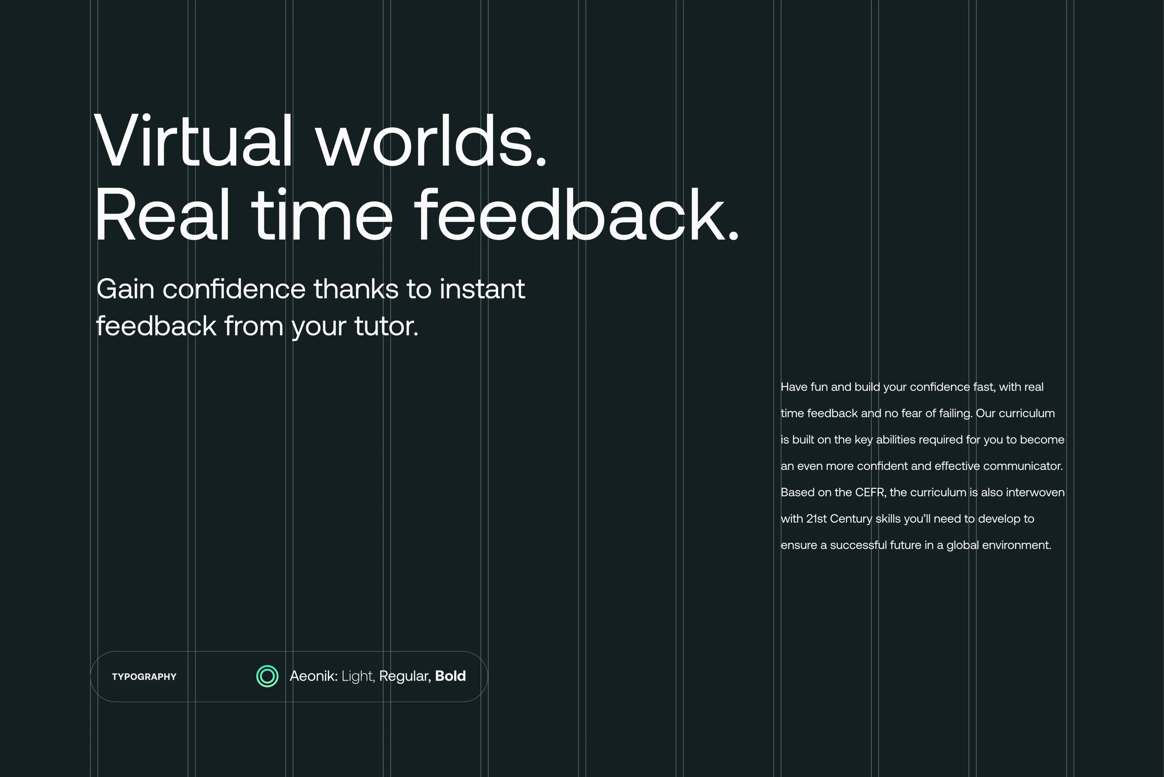
We proposed the name Simmula for its root originating from the word simulate. Simmula has a shared root with non-English languages — simulate’s root is translatable in most languages which makes it universally understood and familiar with the target audience. The messaging is simplistic and direct, keeping in mind non-English speakers, with messages such as Virtual Worlds, Real Time Feedback, highlighting one of Simmula’s selling propositions.
Simmula Learning English in an alternative dimension
Brief
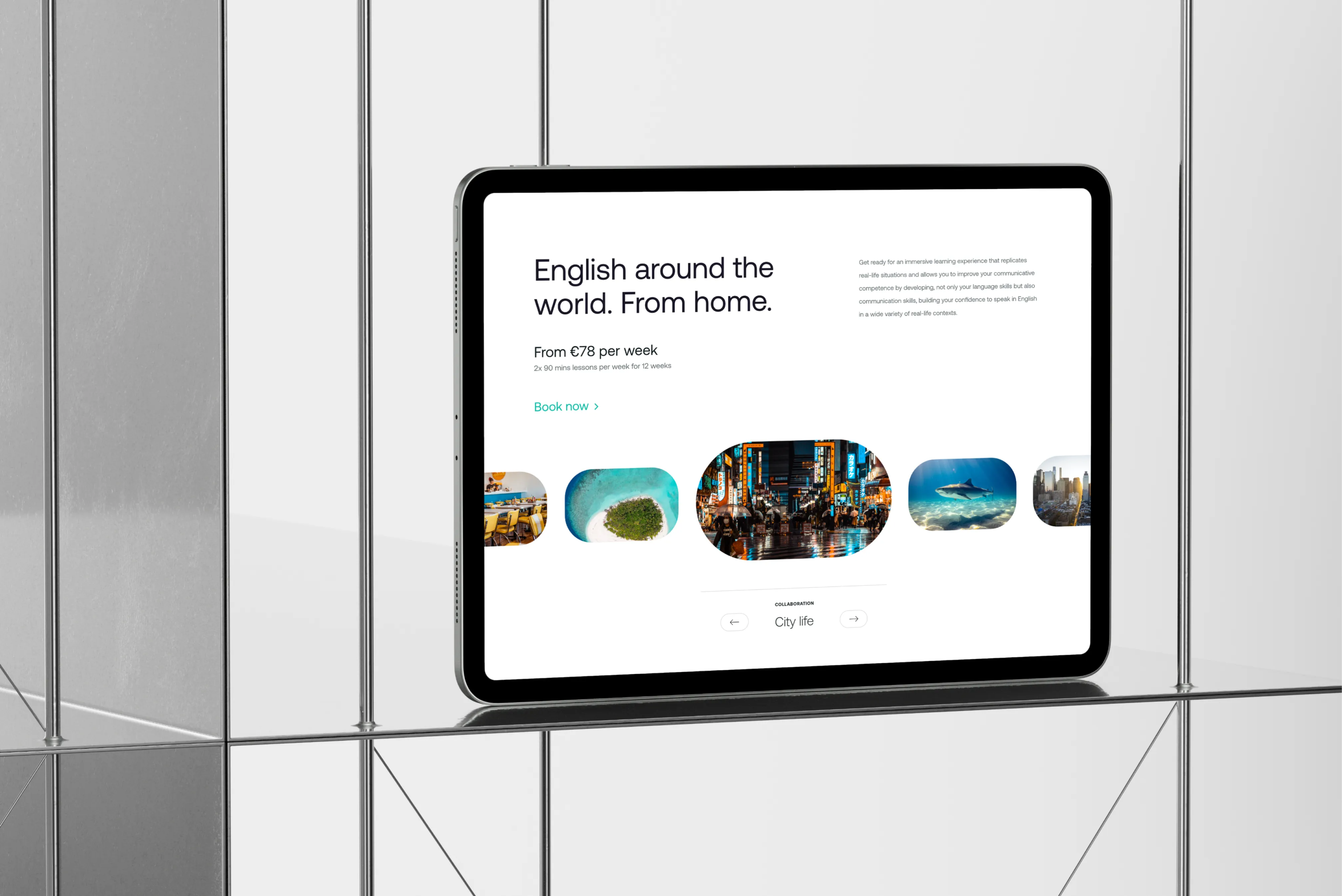
The 2020 pandemic accelerated progress in select industries. This was most evident in technology and education. Students could no longer travel to learn English in an English-speaking environment, but this didn’t stop our client from taking English lessons in an English-speaking environment to their students’ homes. Enter Simmula.
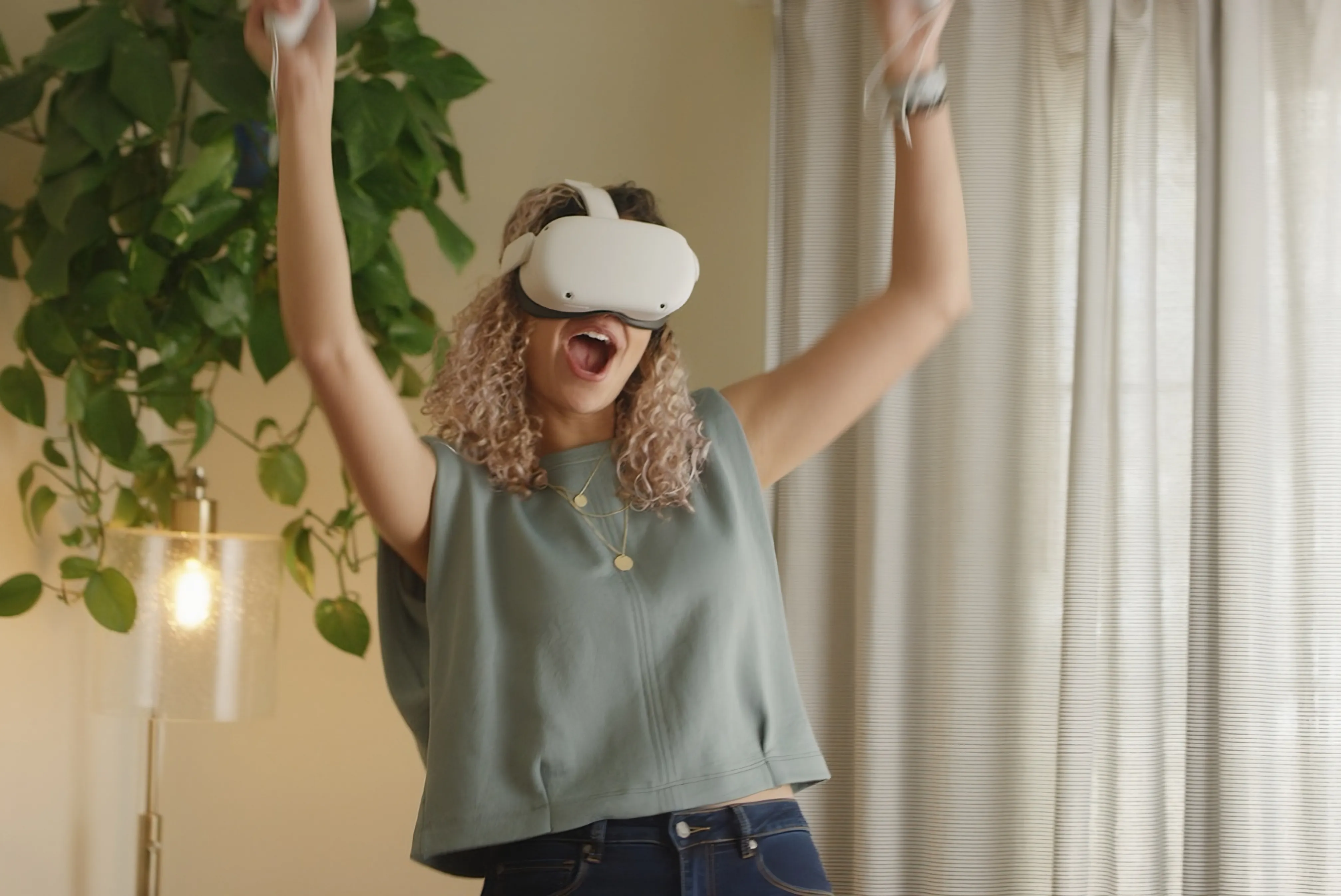
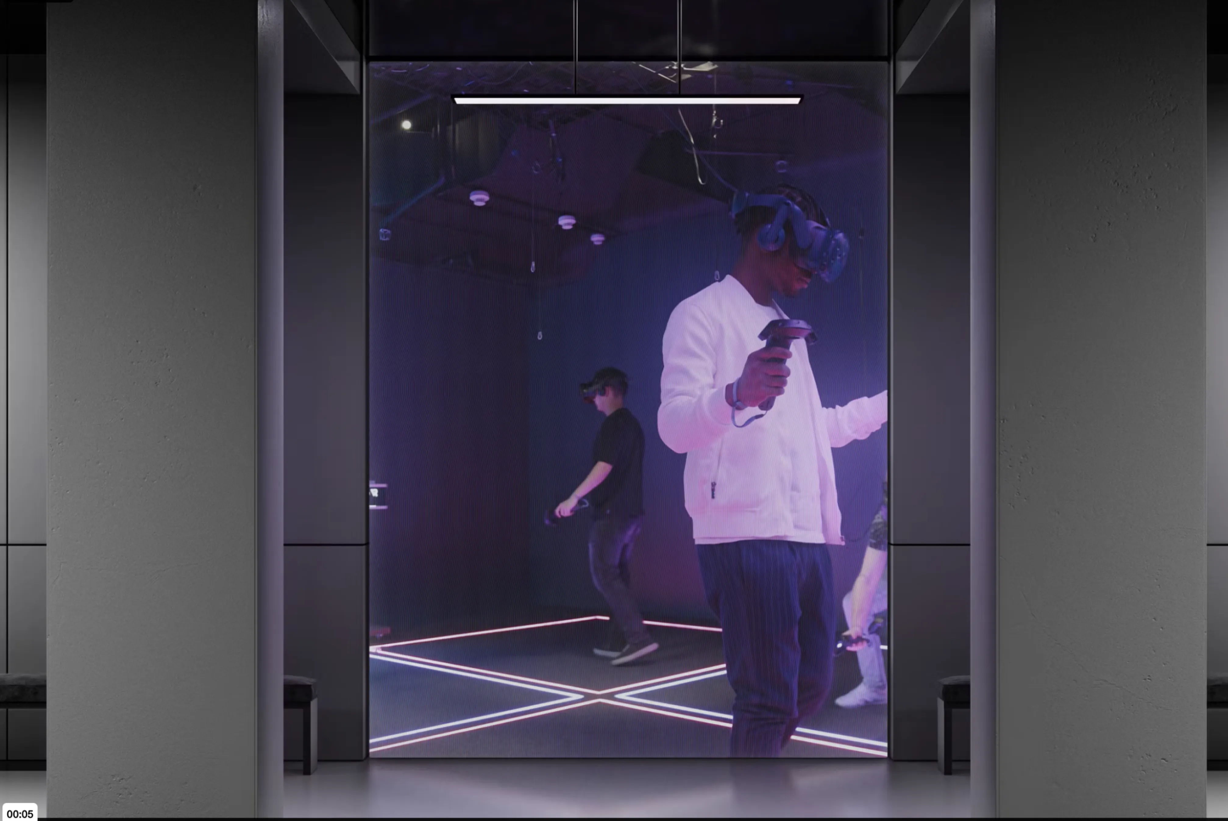
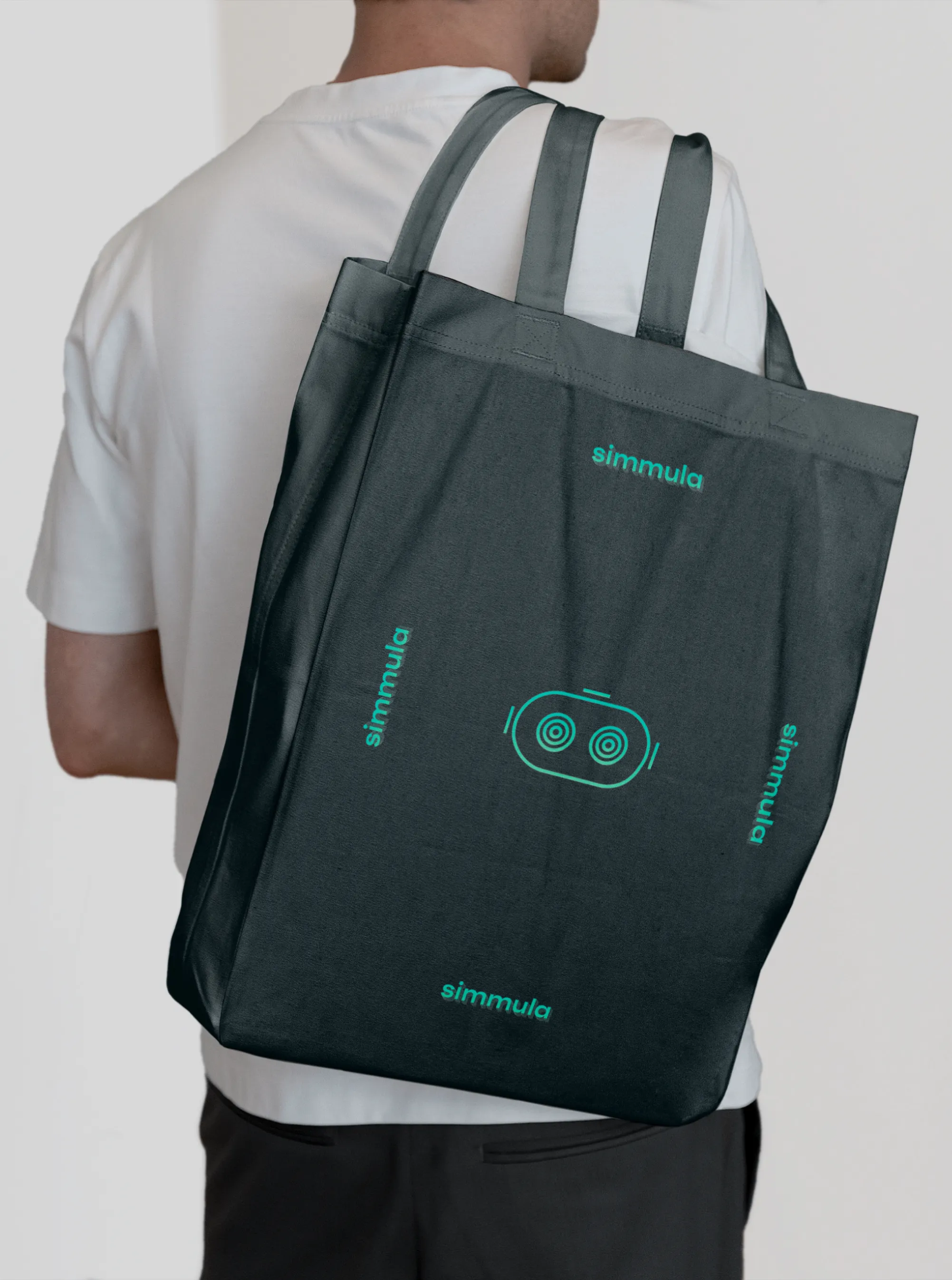
Simmula is a Virtual Reality based English learning experience. Understanding the challenges of Virtual Reality, the visual identity needed to bring familiarity to an otherwise unknown and often intimidating technology. Being an English learning product, Simmula needed to transcend languages and ages, from its name down to the visual identity.
Services
web design
collateral design
copywriting
communications
brand identity
naming
APPROACH


OUTCOME
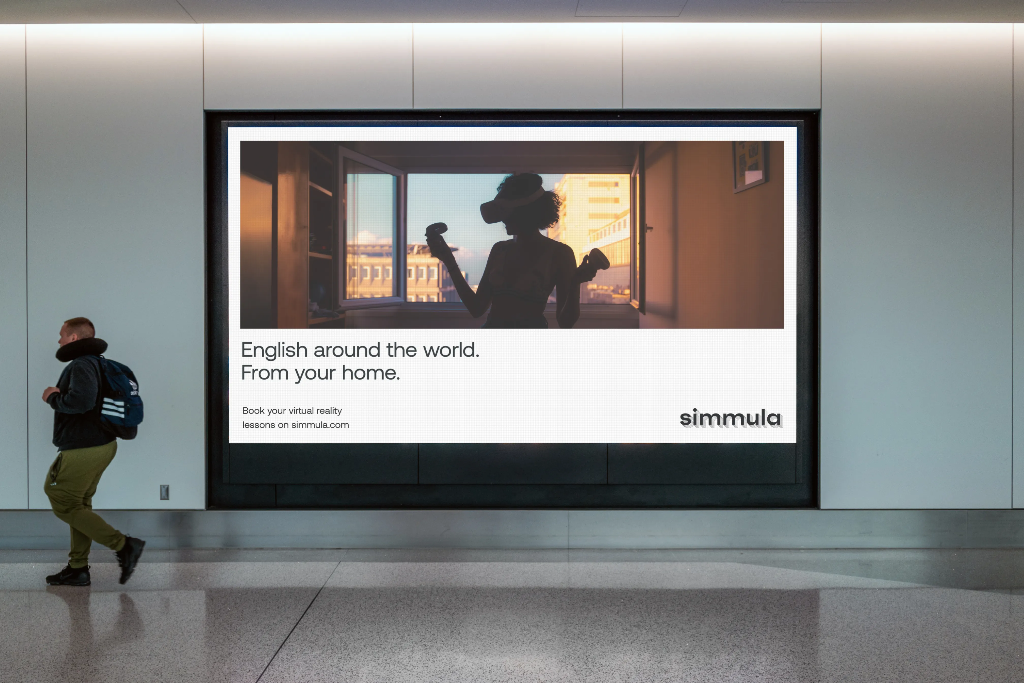
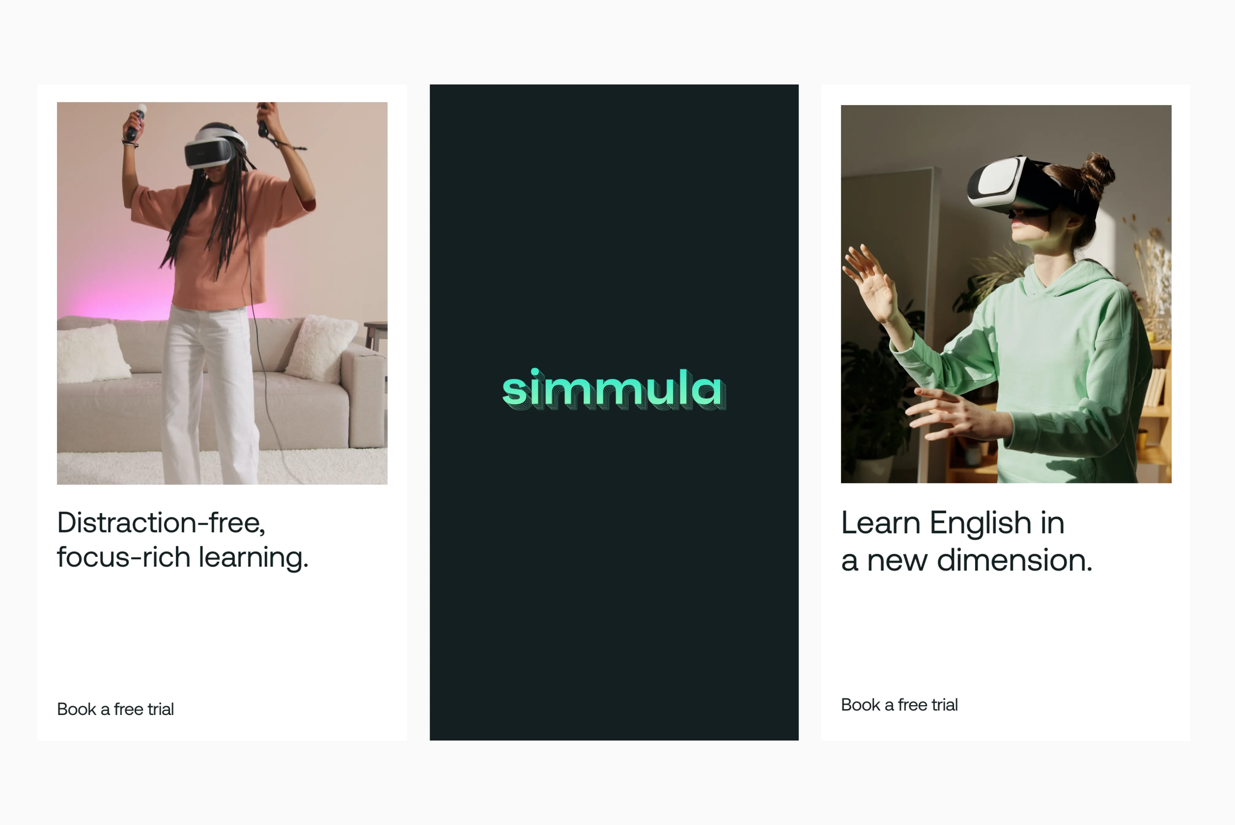
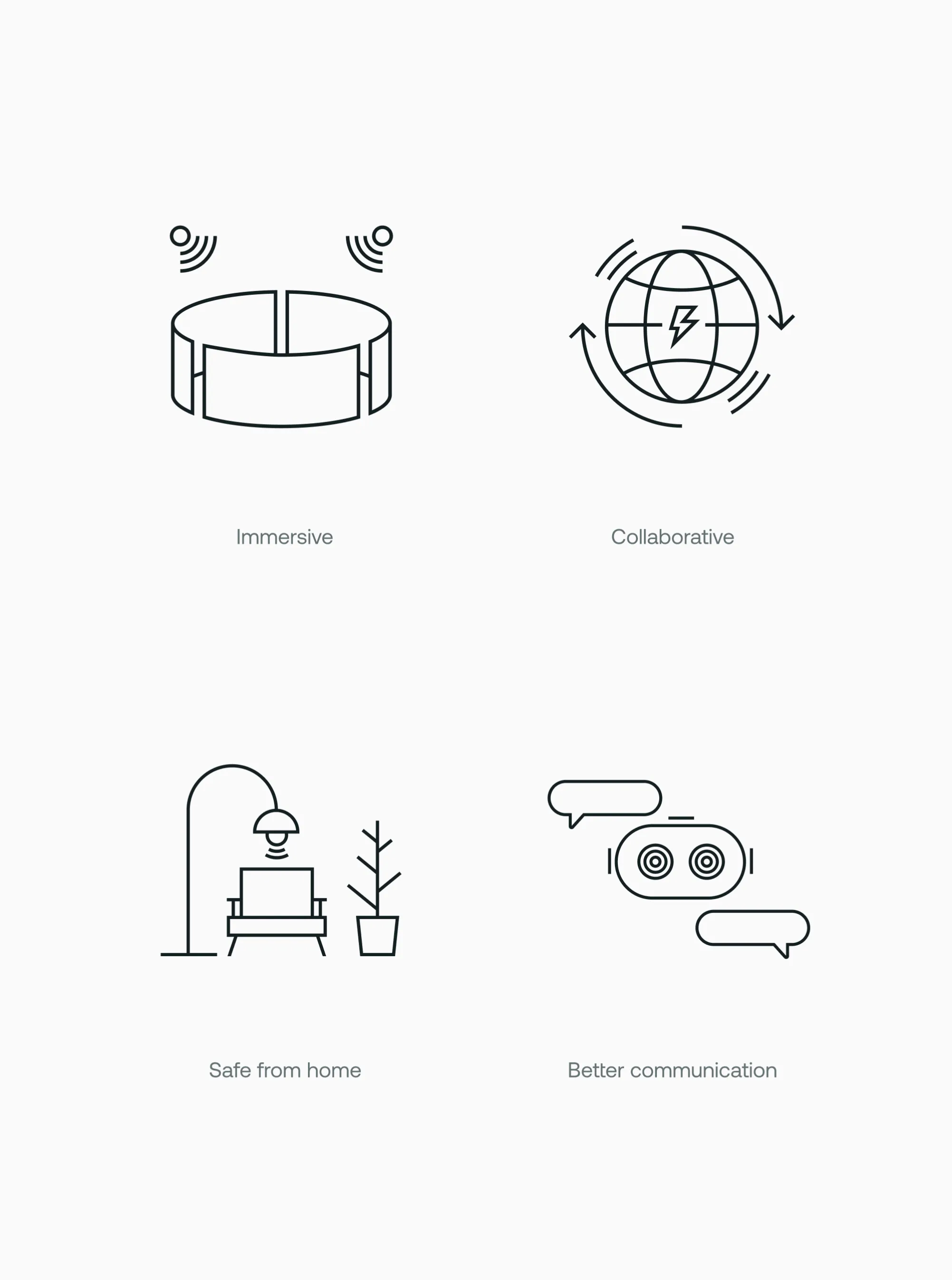
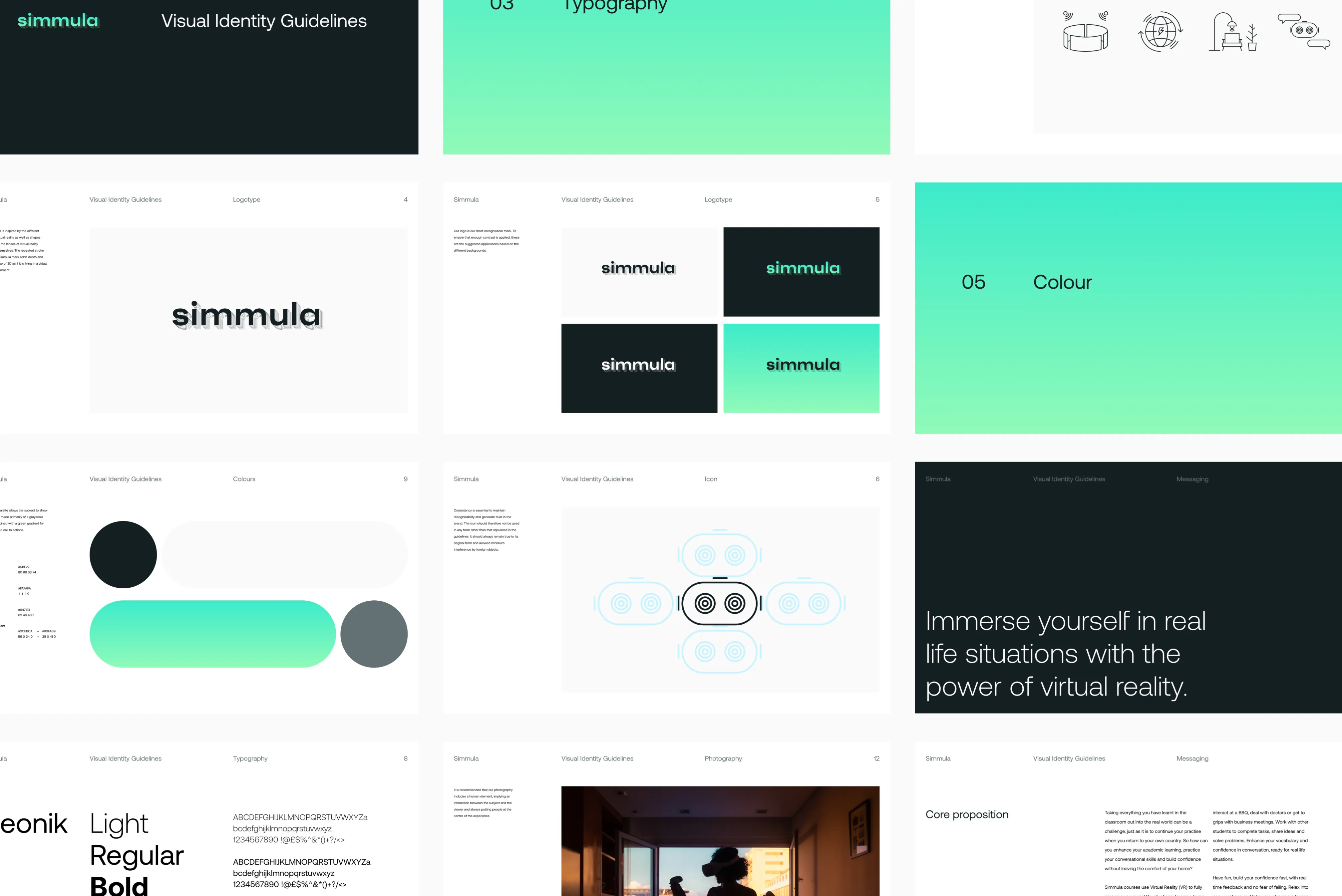
The visual identity needed to allow a voice for all the participants of the Simmula experience: the device, the courses, the teachers and the students, of different ages and nationalities. This called for a brand that is simplistic, devoid of any visual excess and distant from any trends. The result is a visual identity that scales and adapts, preparing the business for any future product development or experiences.

NextpenseNext-level expenses


