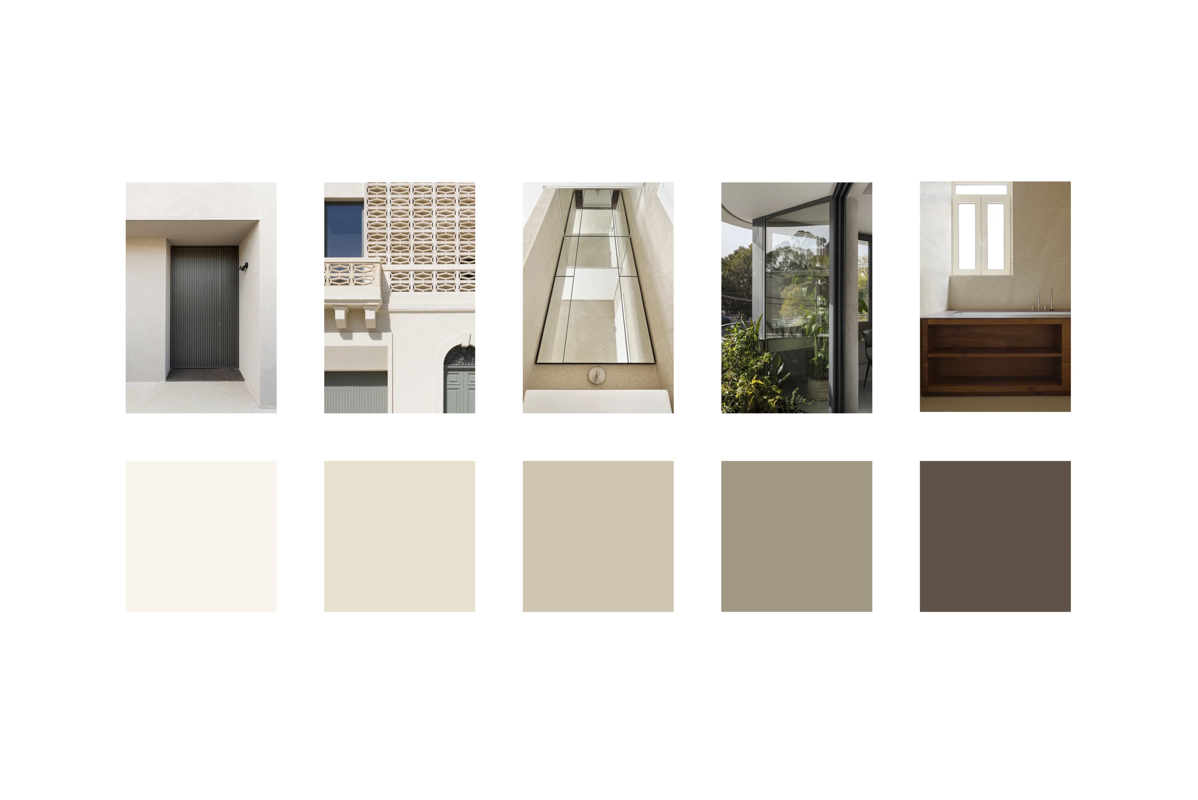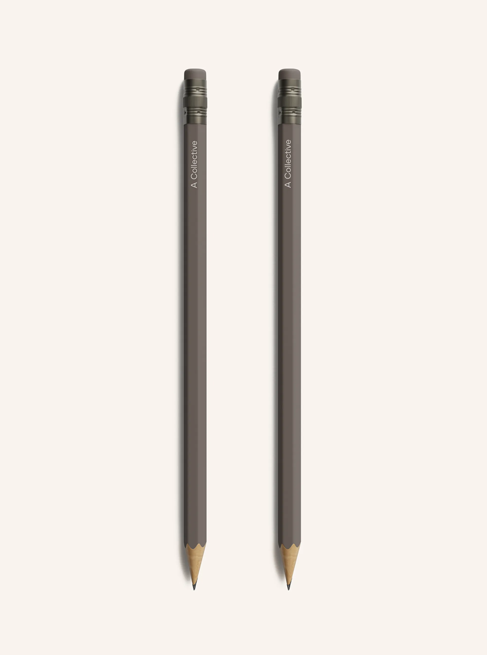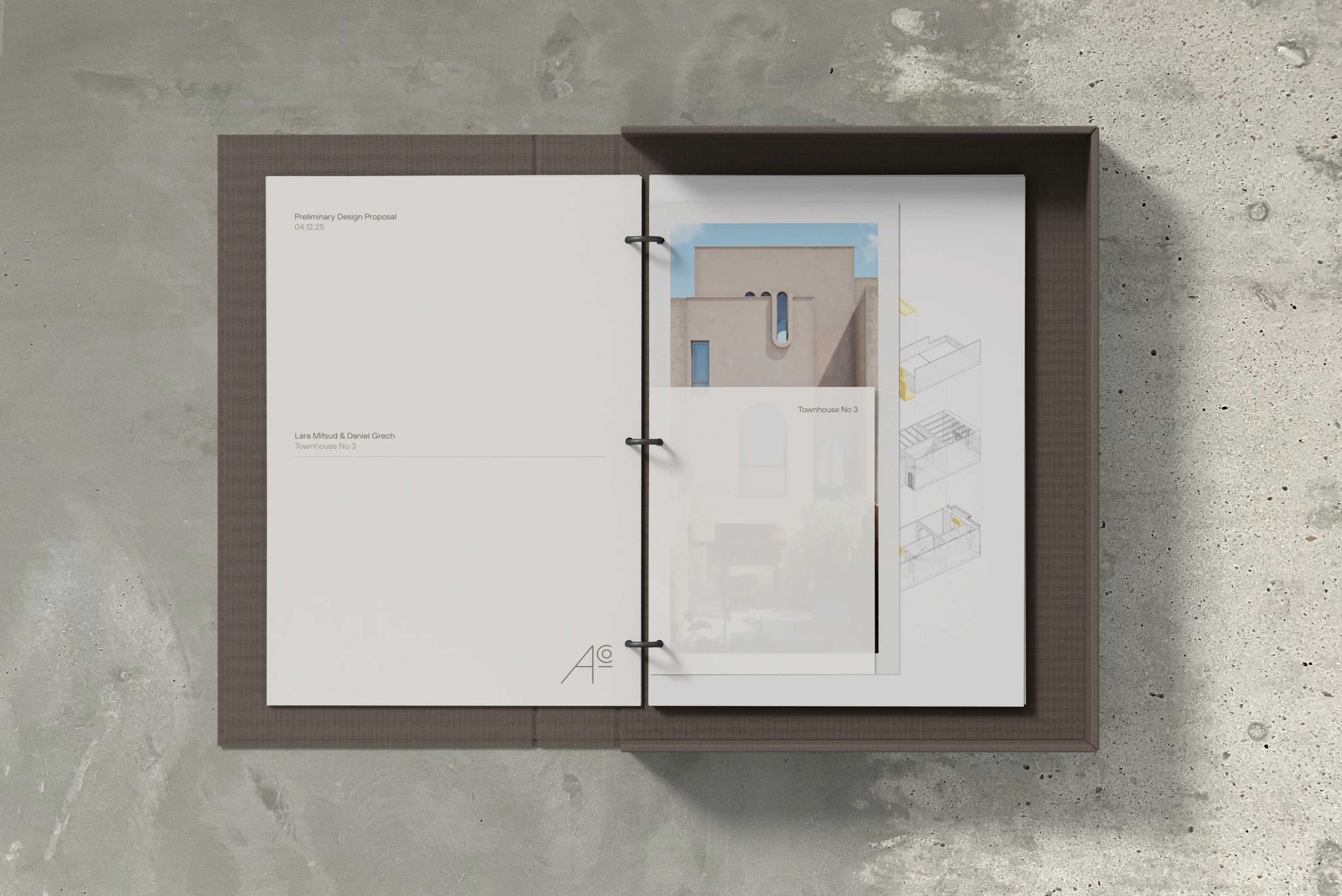
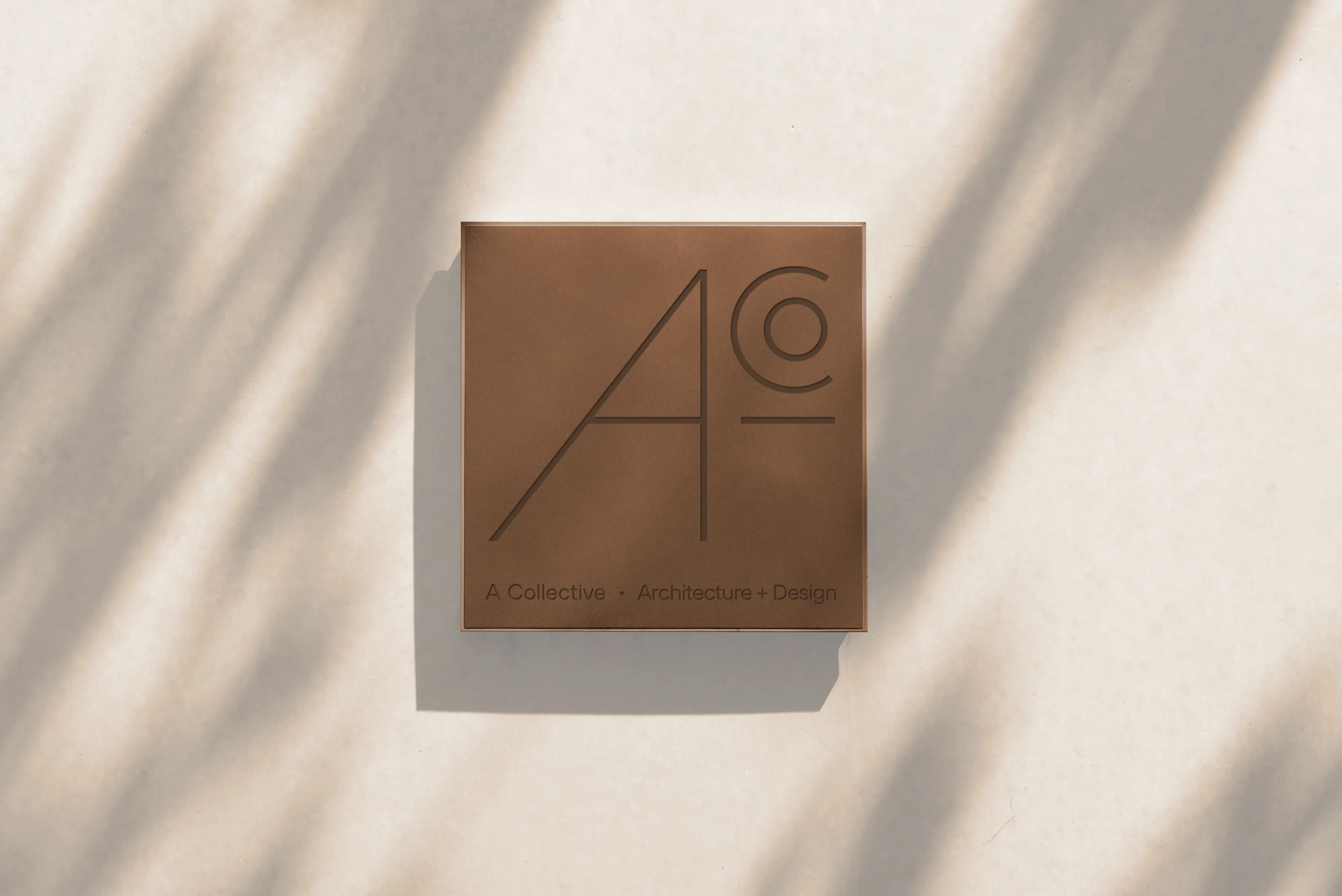
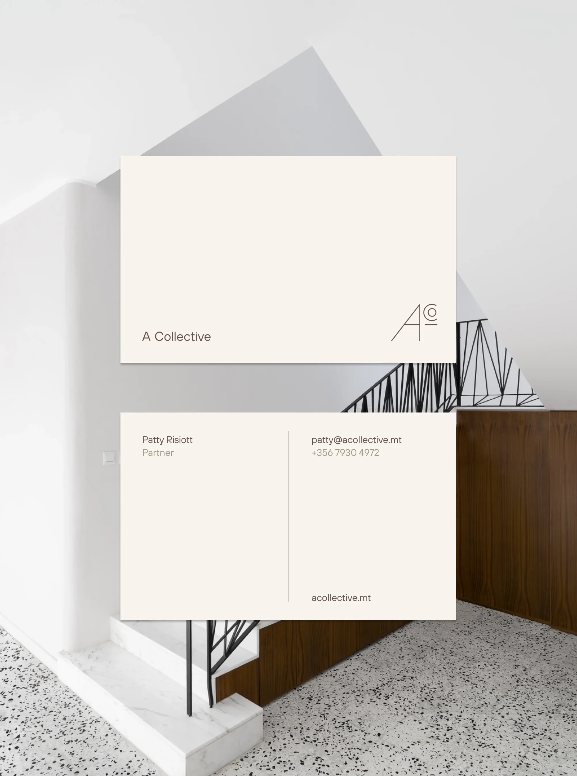
The project began by defining a clearer visual language for the brand. The old logotype worked only in specific vertical formats, which created practical limitations when applying the brand across different materials and scales. A new identity system was needed, one that captured A Collective’s values of structure, balance and minimalism while performing well in both spacious and constrained layouts.
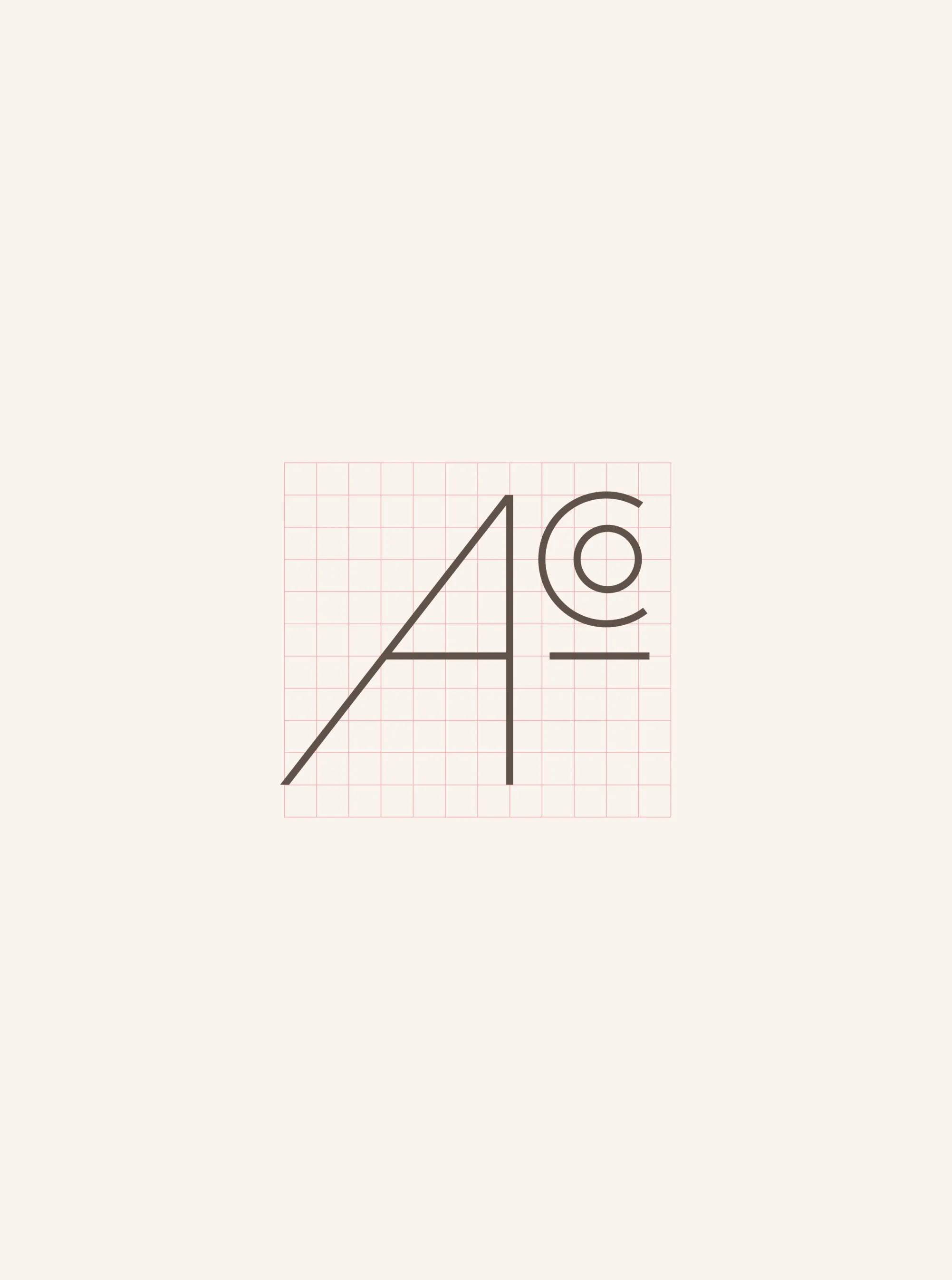
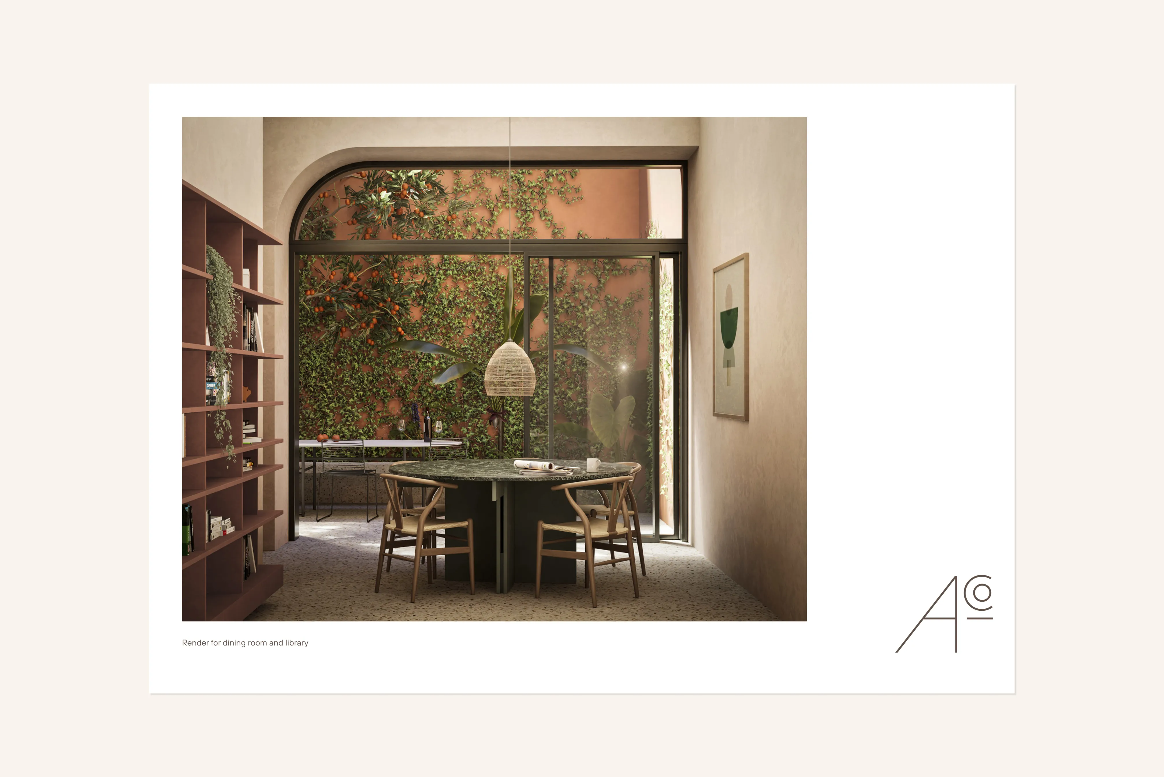
Exploration of the mark emerged naturally from this need. We examined the abbreviation for “Collective” and moved beyond the instinctive choice of a single C, looking for a configuration that carried more conceptual weight. This led to combining A, C and O into a unified structure. By giving the A a more prominent role, its crossbar became a connecting element: extending as a horizontal line that anchors the composition, supports the CO, and subtly forms a plus symbol that evokes the idea of a collective. The result is a minimal, geometric mark that remains distinct and recognisable at any size, and that works independently where the full logotype cannot.
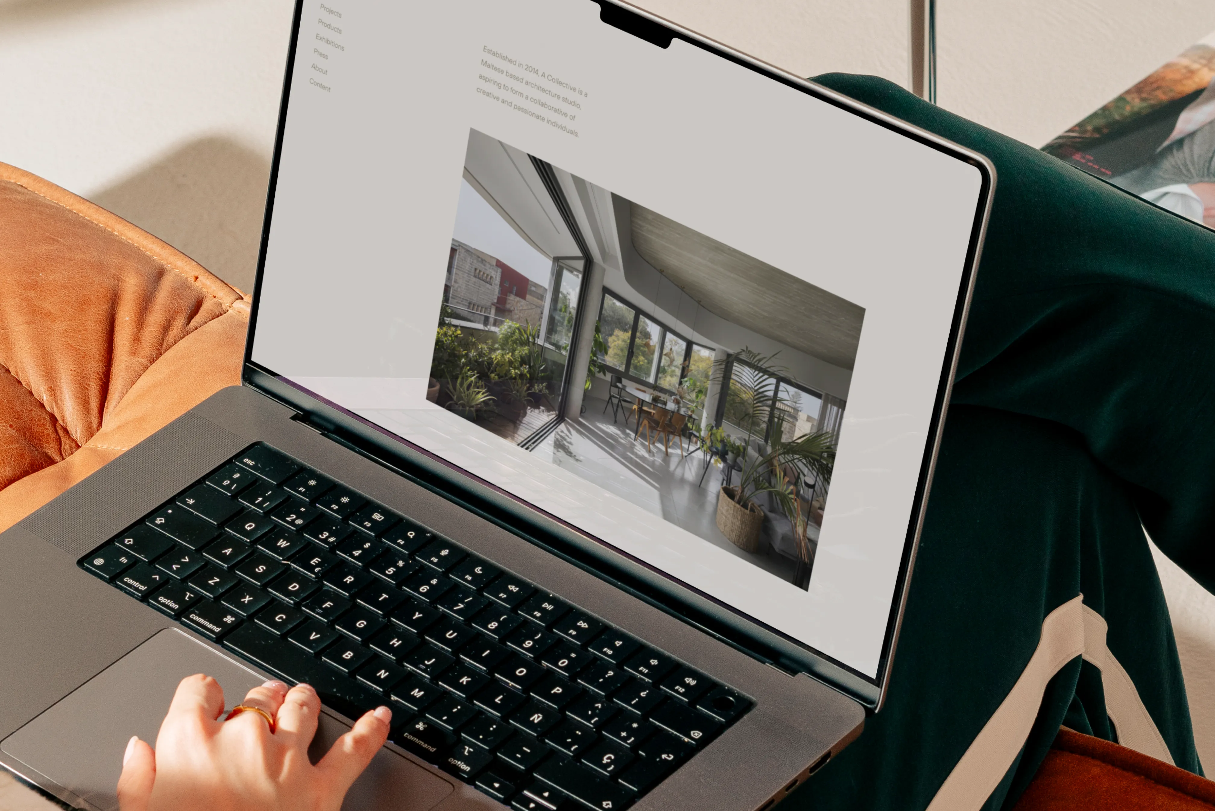
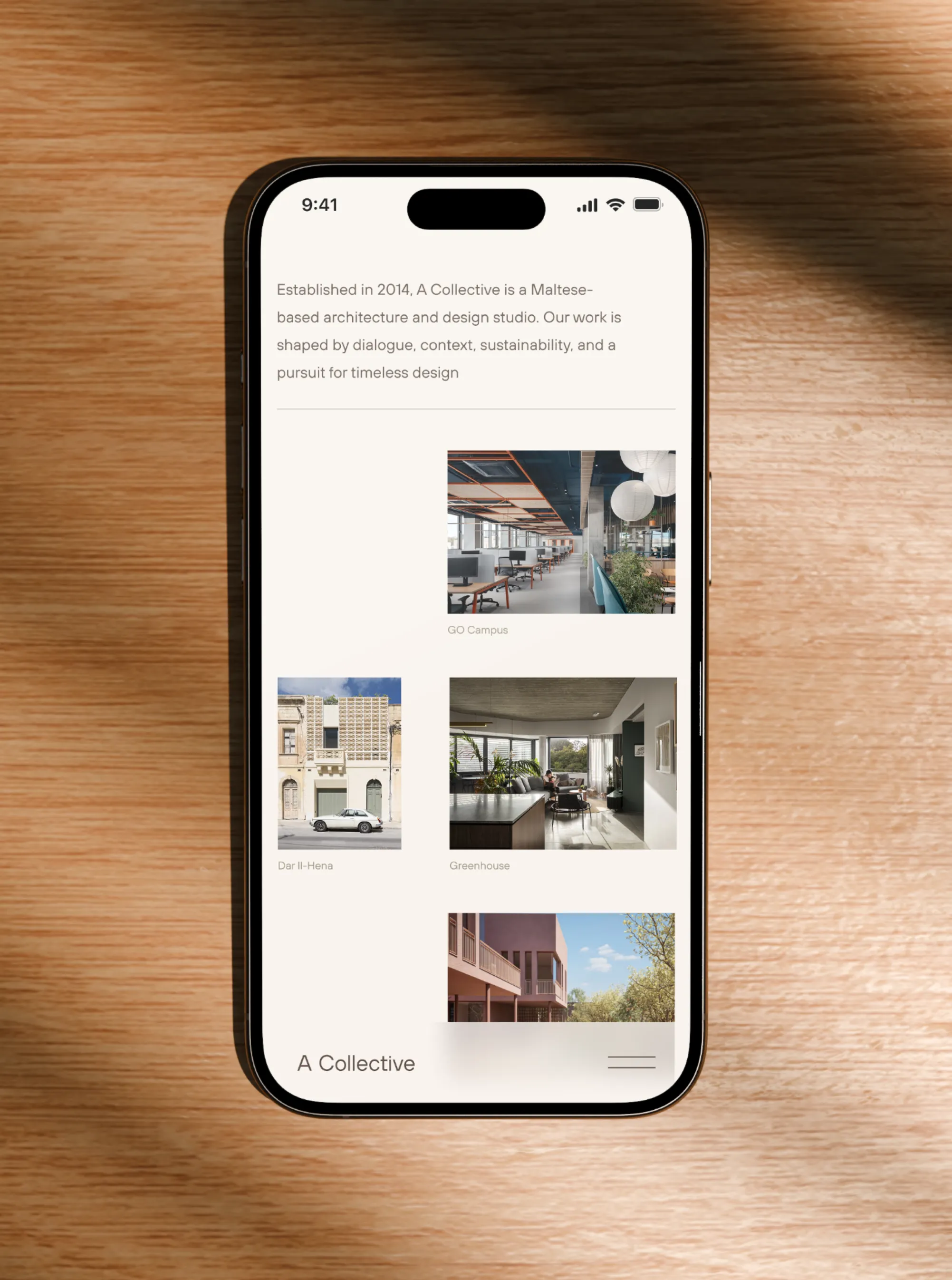
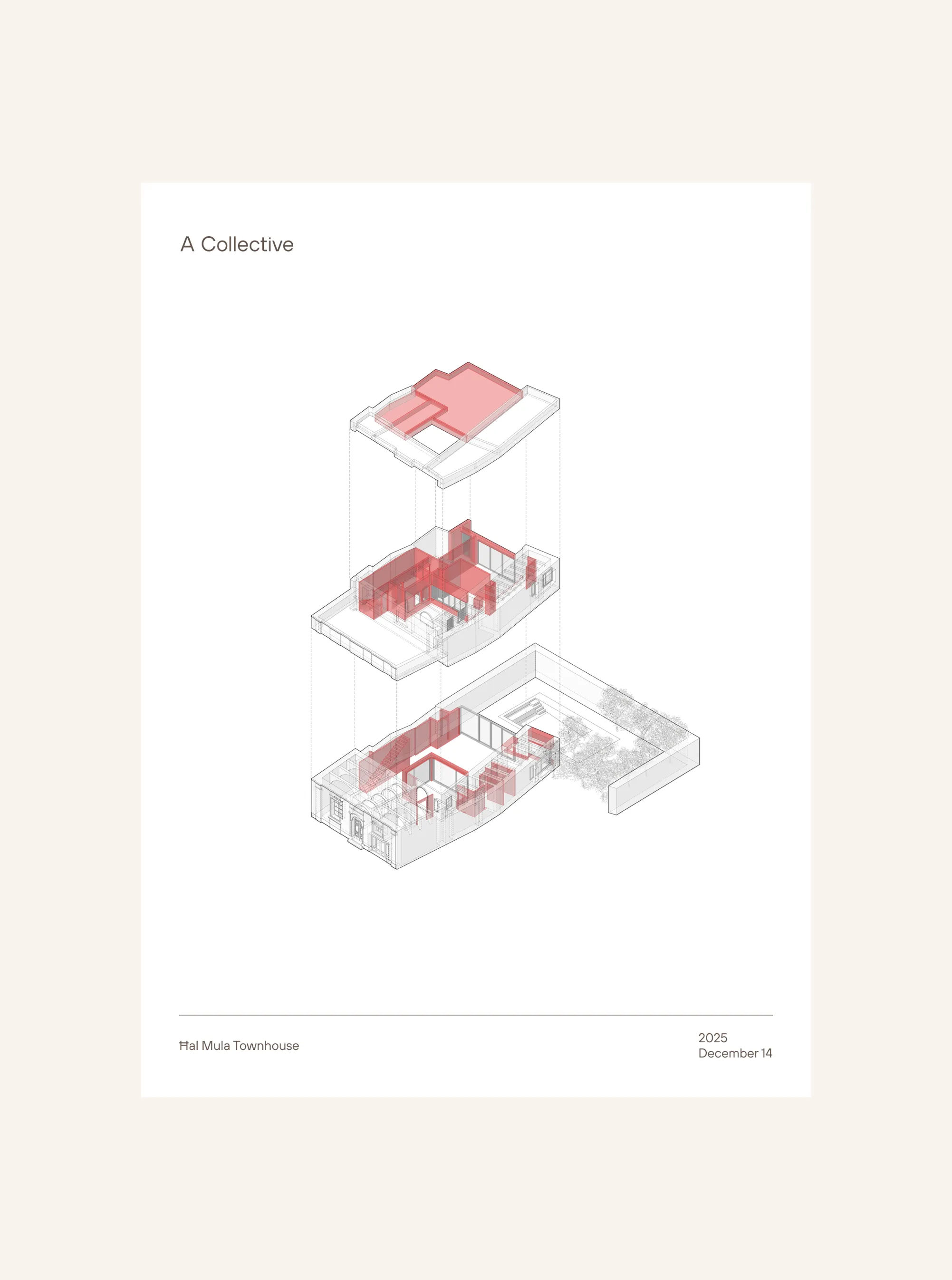
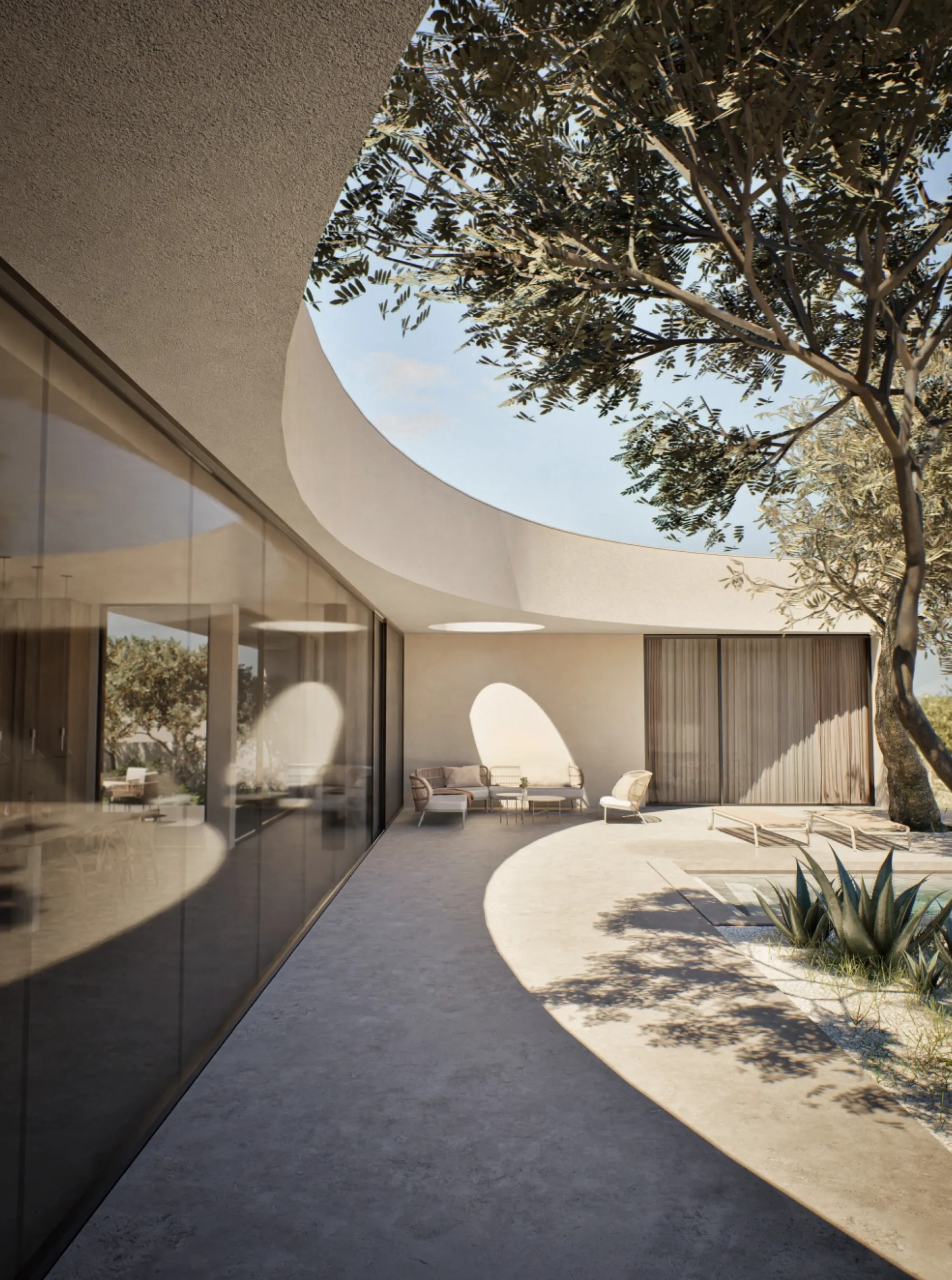
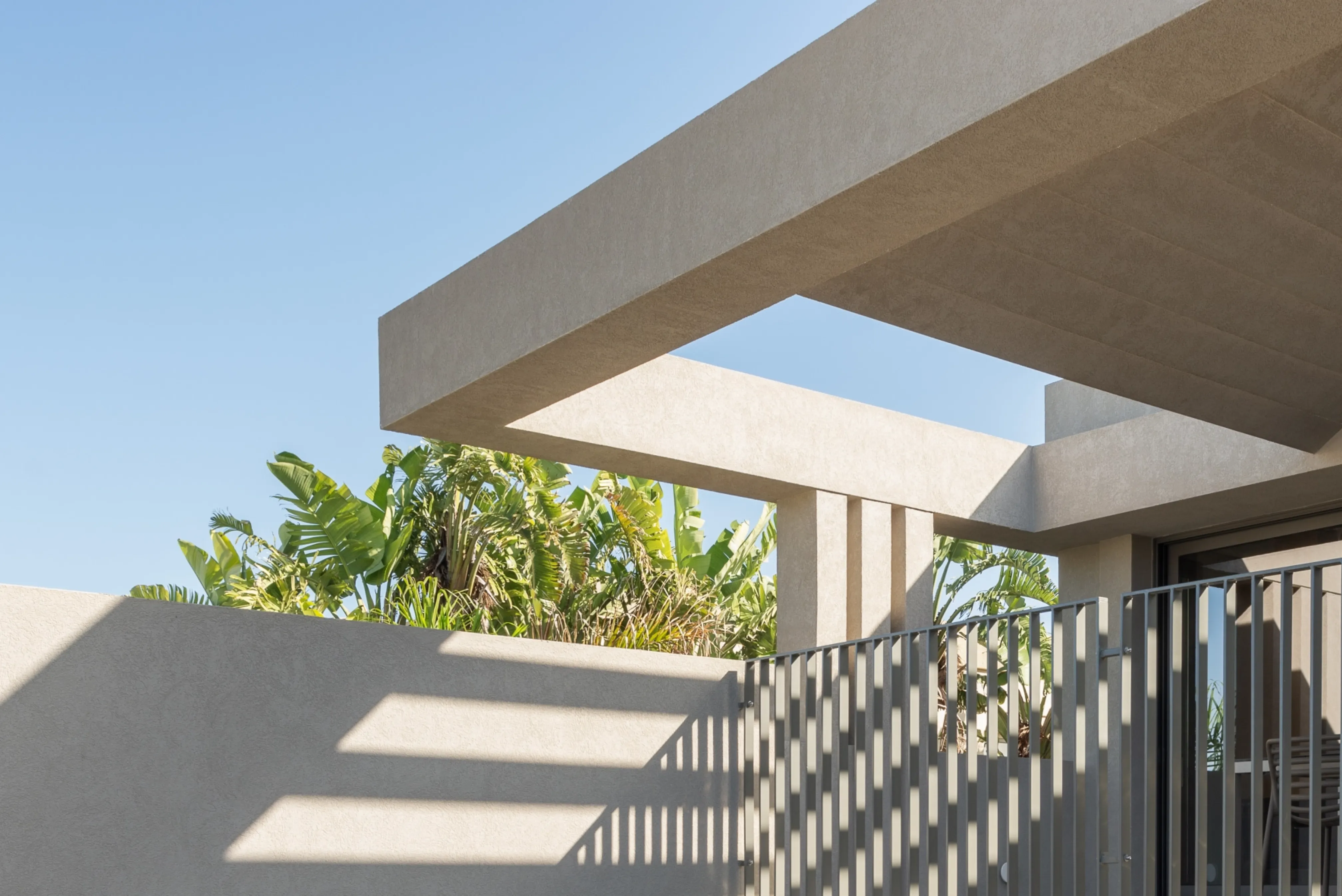
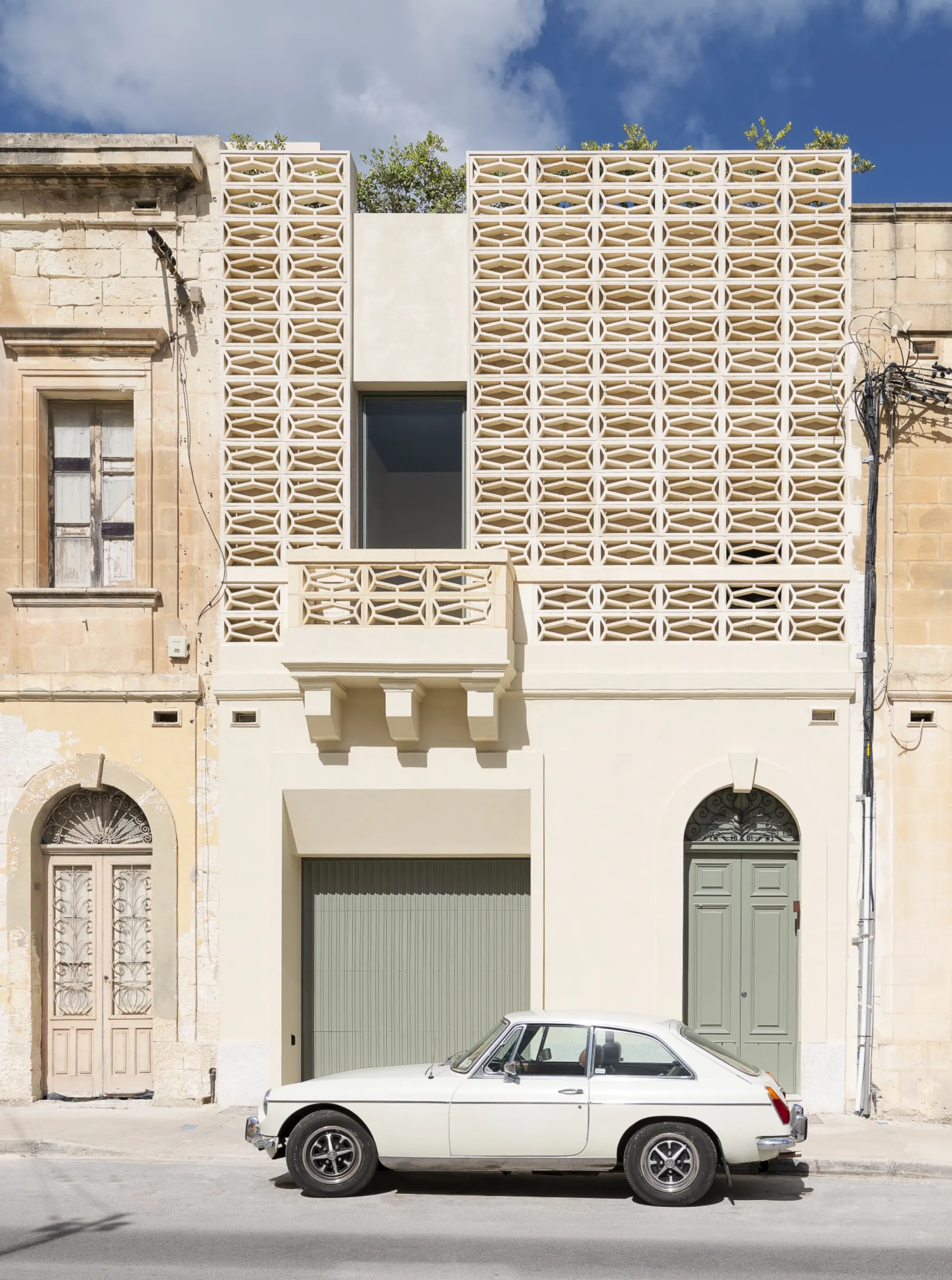
For the website, the priority was to elevate the way projects are presented. Although the site is not the primary revenue driver for the business, it plays a critical role in shaping perception. We designed a modular system that gives the team full flexibility when building case studies, allowing each project to unfold in a way that mirrors A Collective’s own architectural process: from plan to finish, with minimal distraction and full visual immersion.