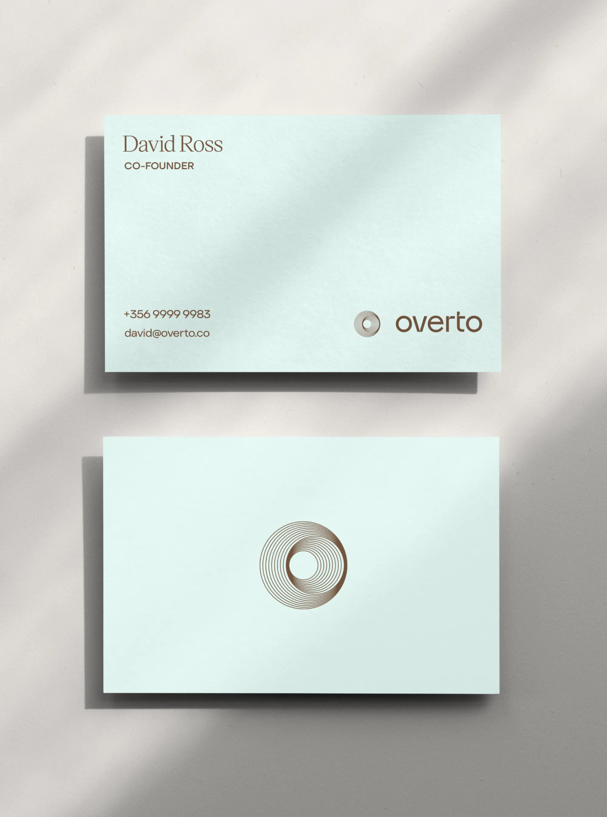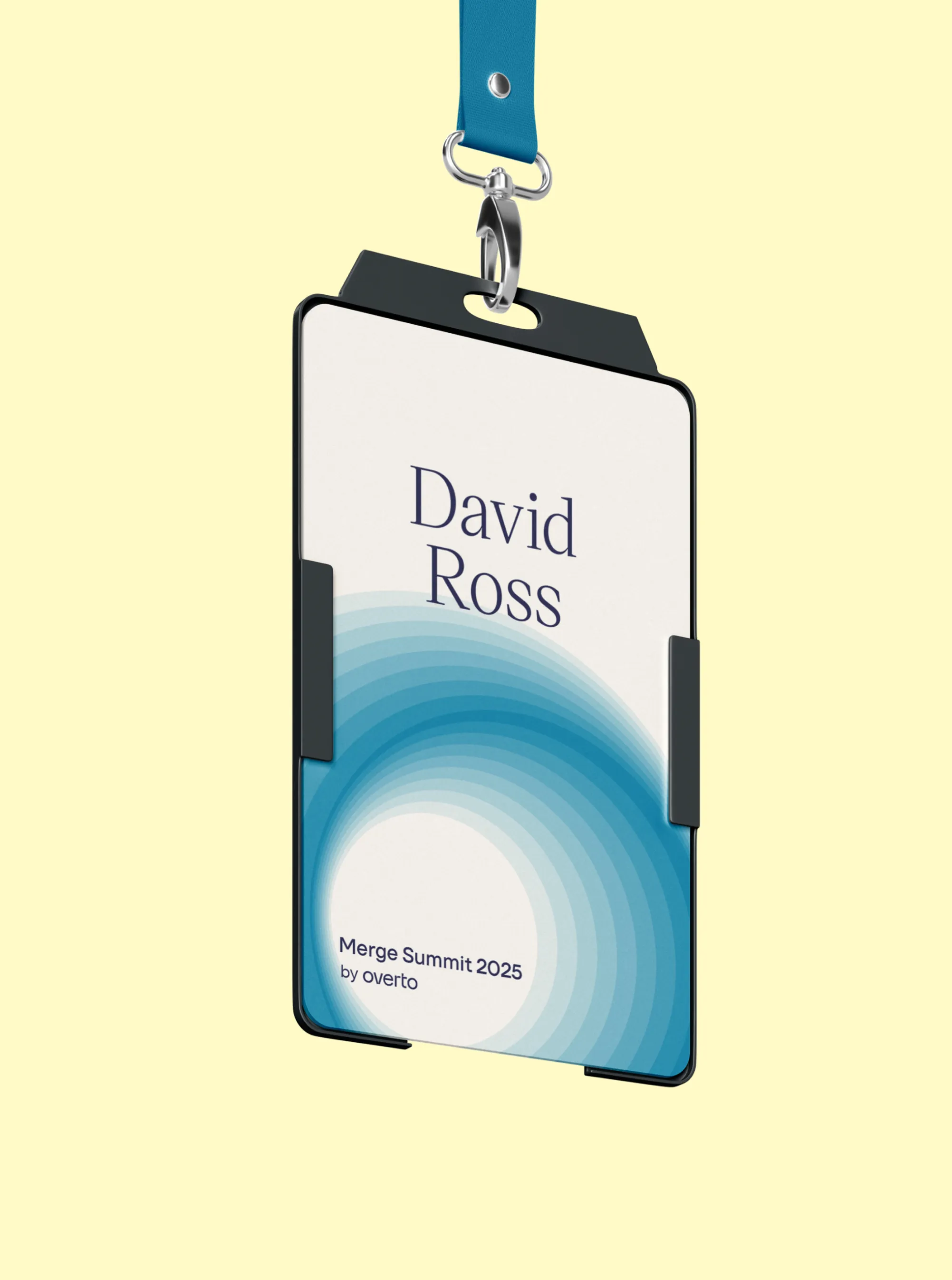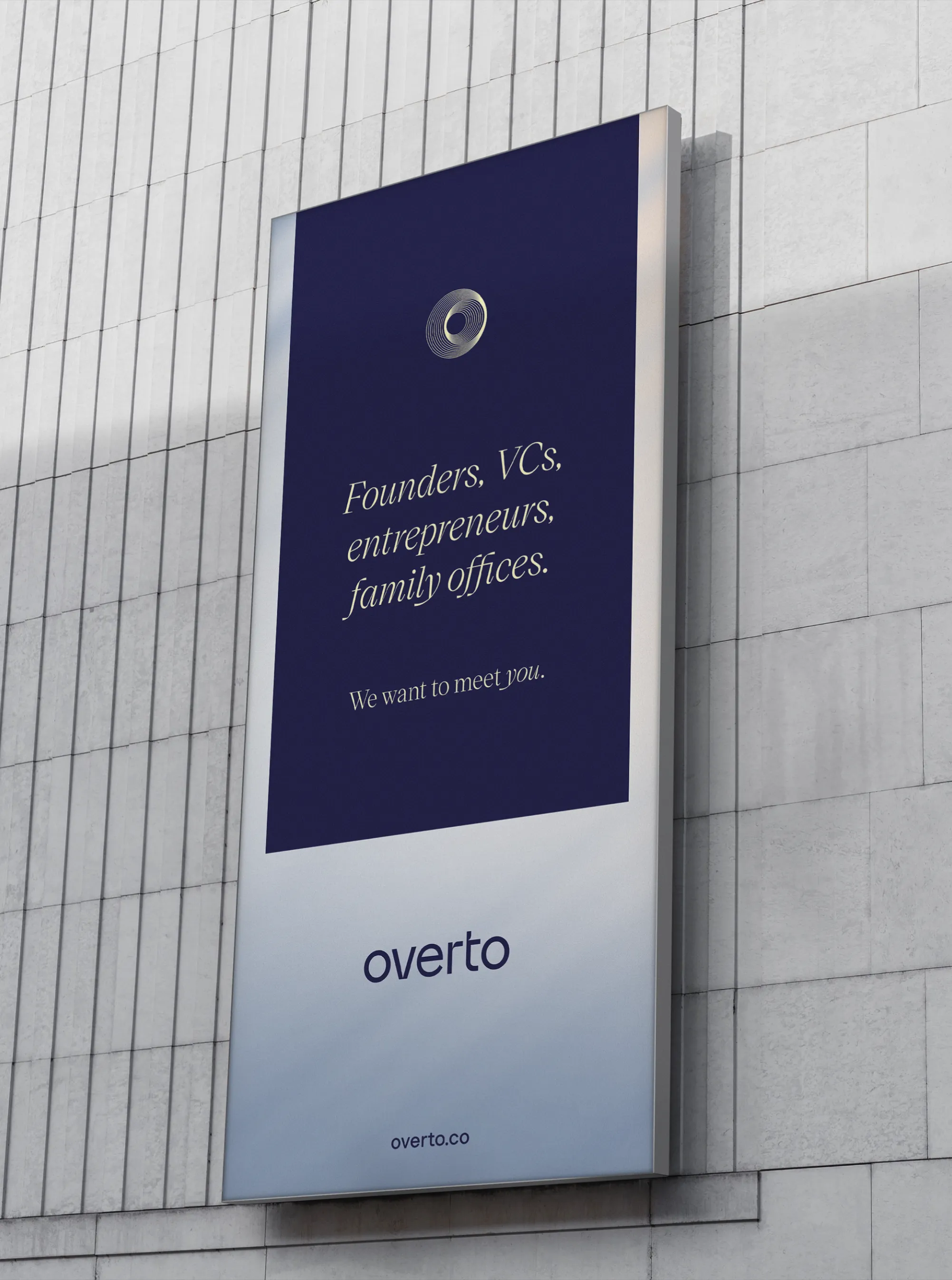


The name Overto, derived from “overture,” reflects the brand’s open and proactive approach to supporting businesses and investors as they navigate the marketplace and seize valuable opportunities.
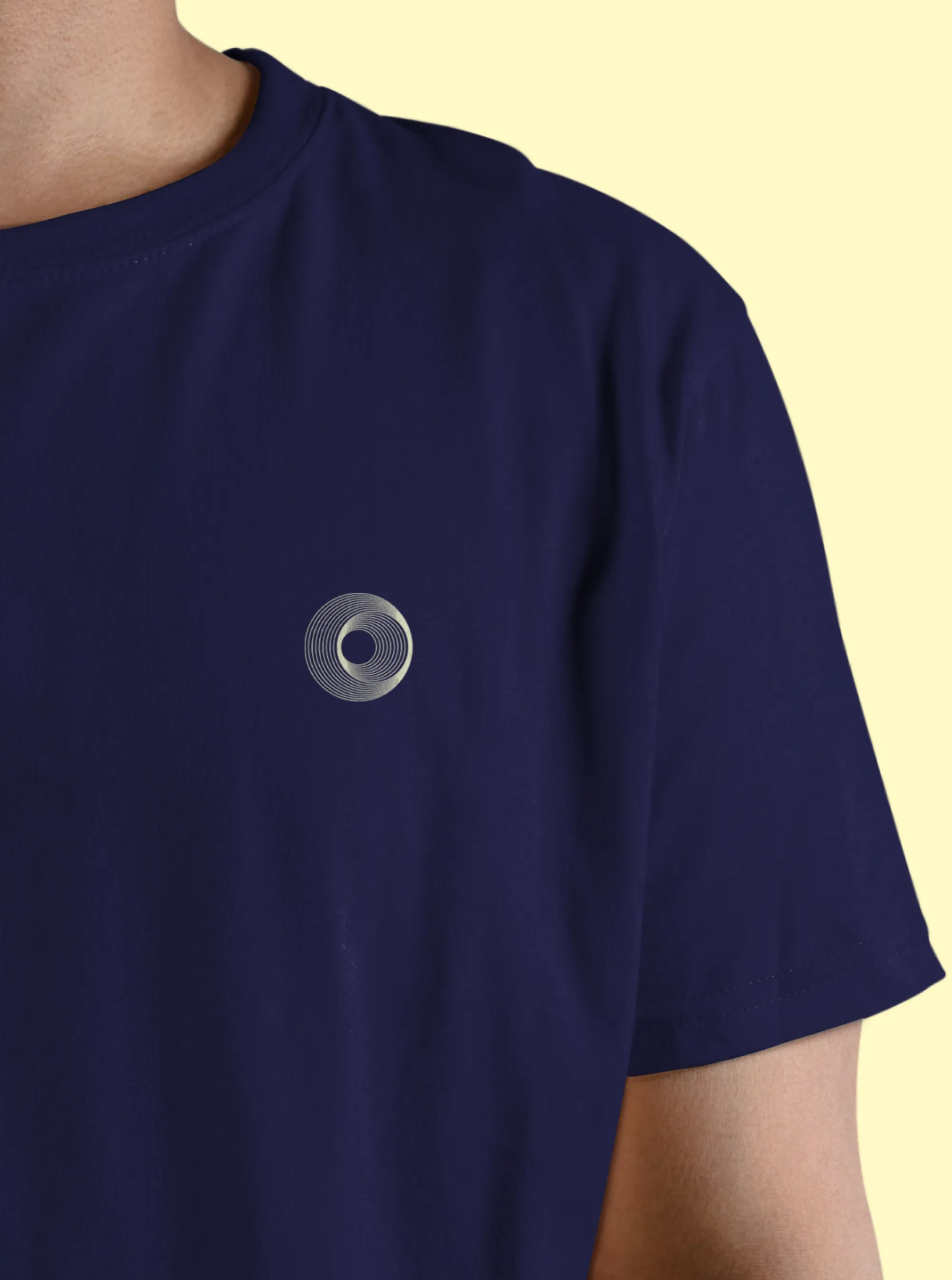
From here, the brand development focused on the theme of openness—interpreted in various ways. Overto is open-minded, open to new opportunities, and transparent in their operations. These are qualities we reflected in the Overto brand mark, where layers of circles within an “O” create a sense of depth while maintaining complete transparency, embodying the values of clarity and honesty.
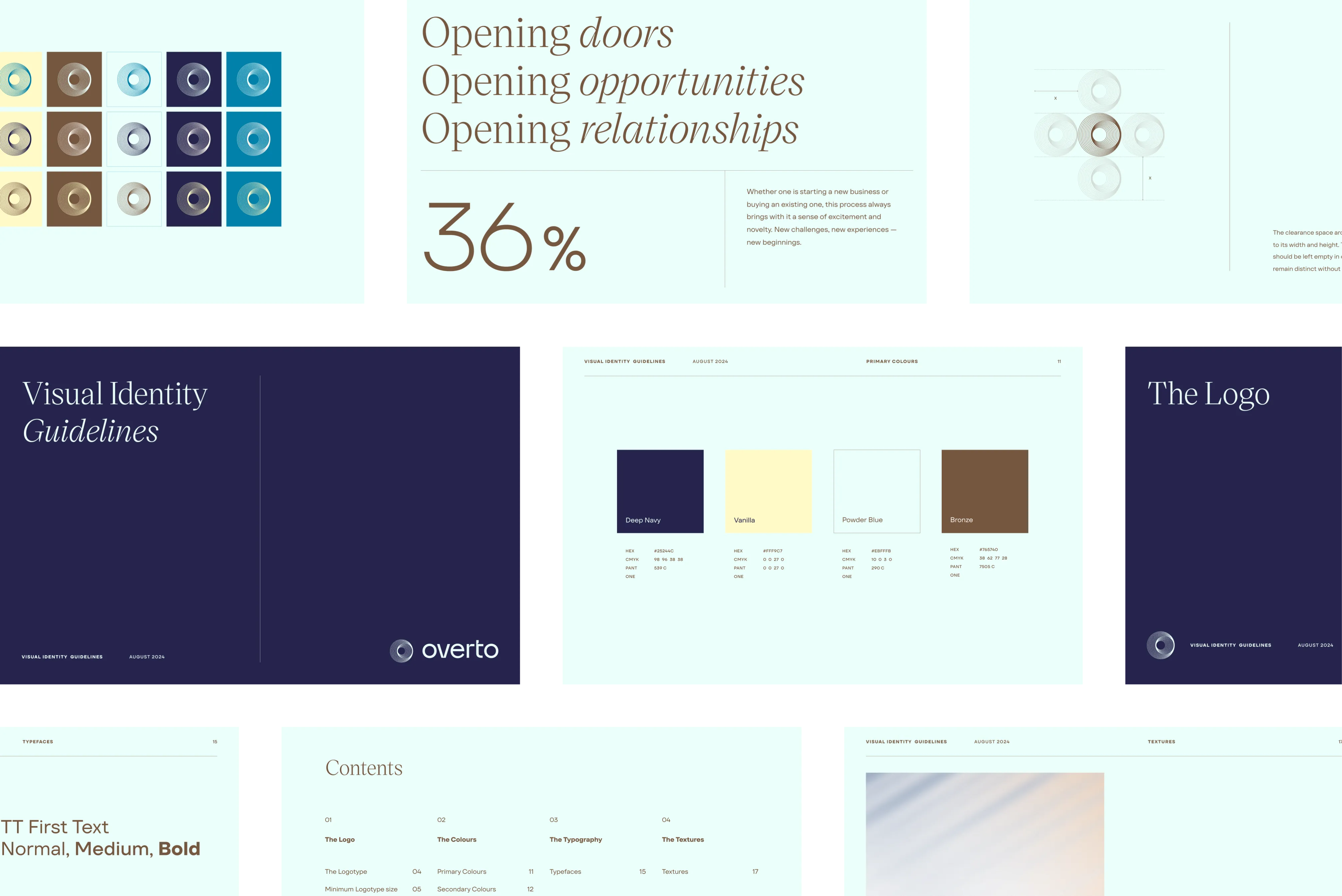
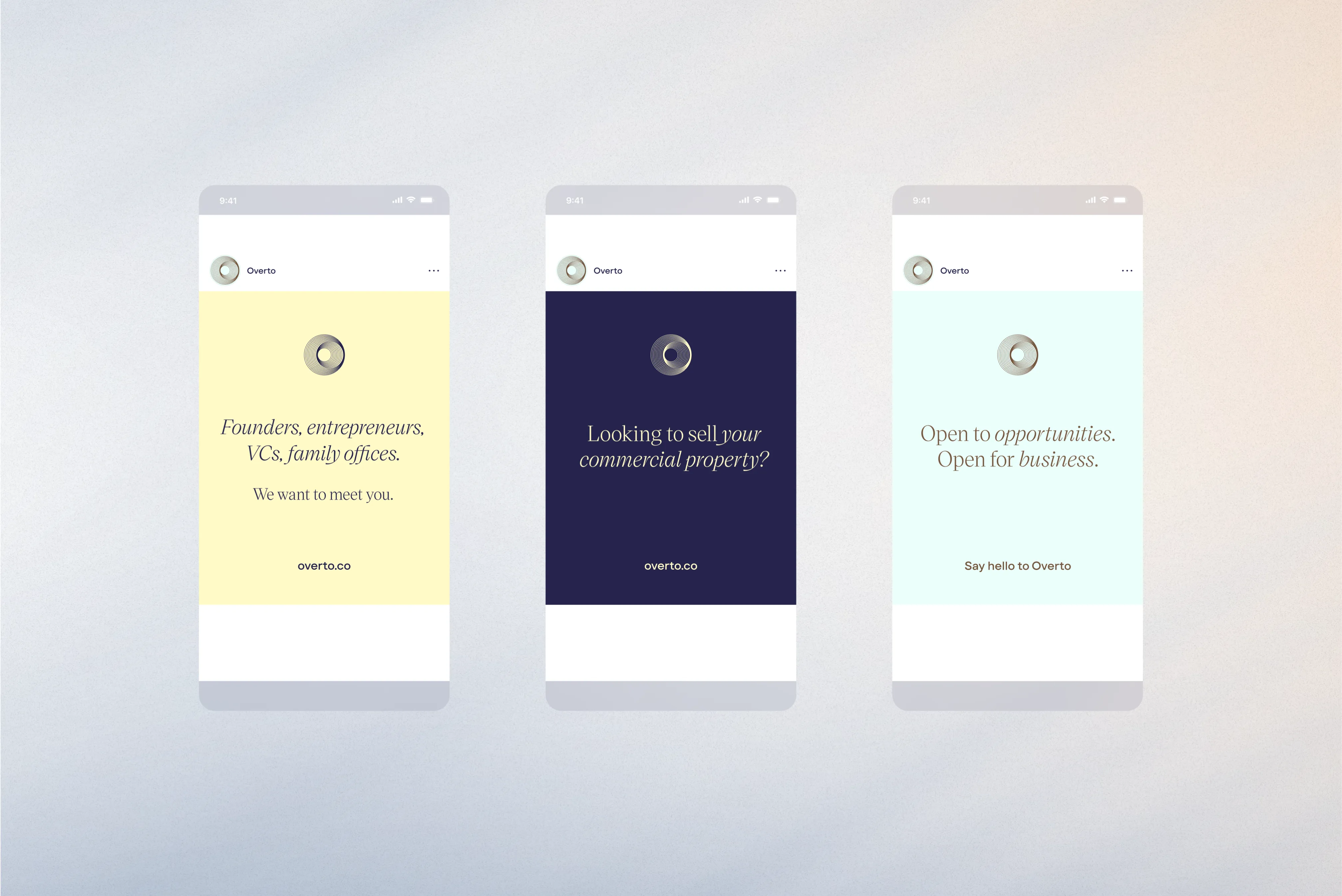
The colour palette features soft pastels that evoke calm and provide a minimal, non-intrusive foundation. Using these colours, we developed a subtle texture inspired by rays of light passing through a glass door, which serves as an understated backdrop to graphics and messaging.
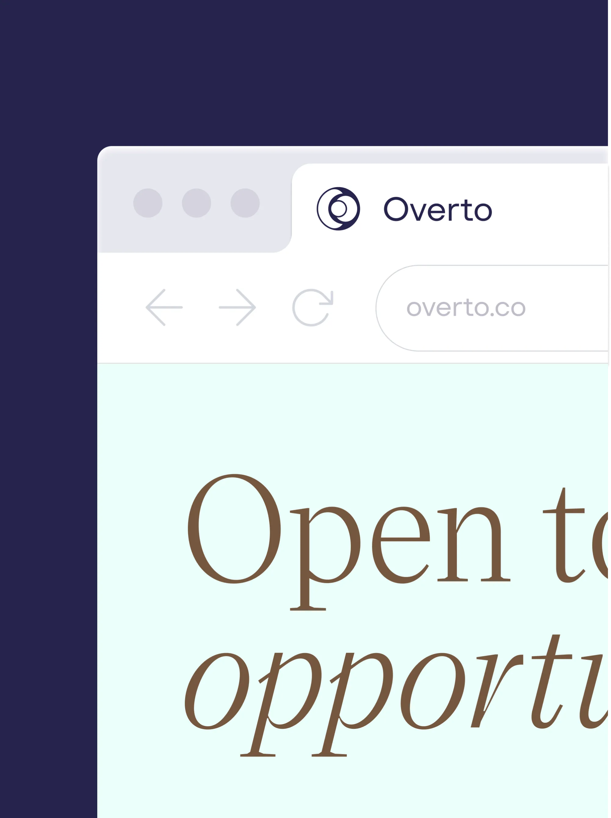
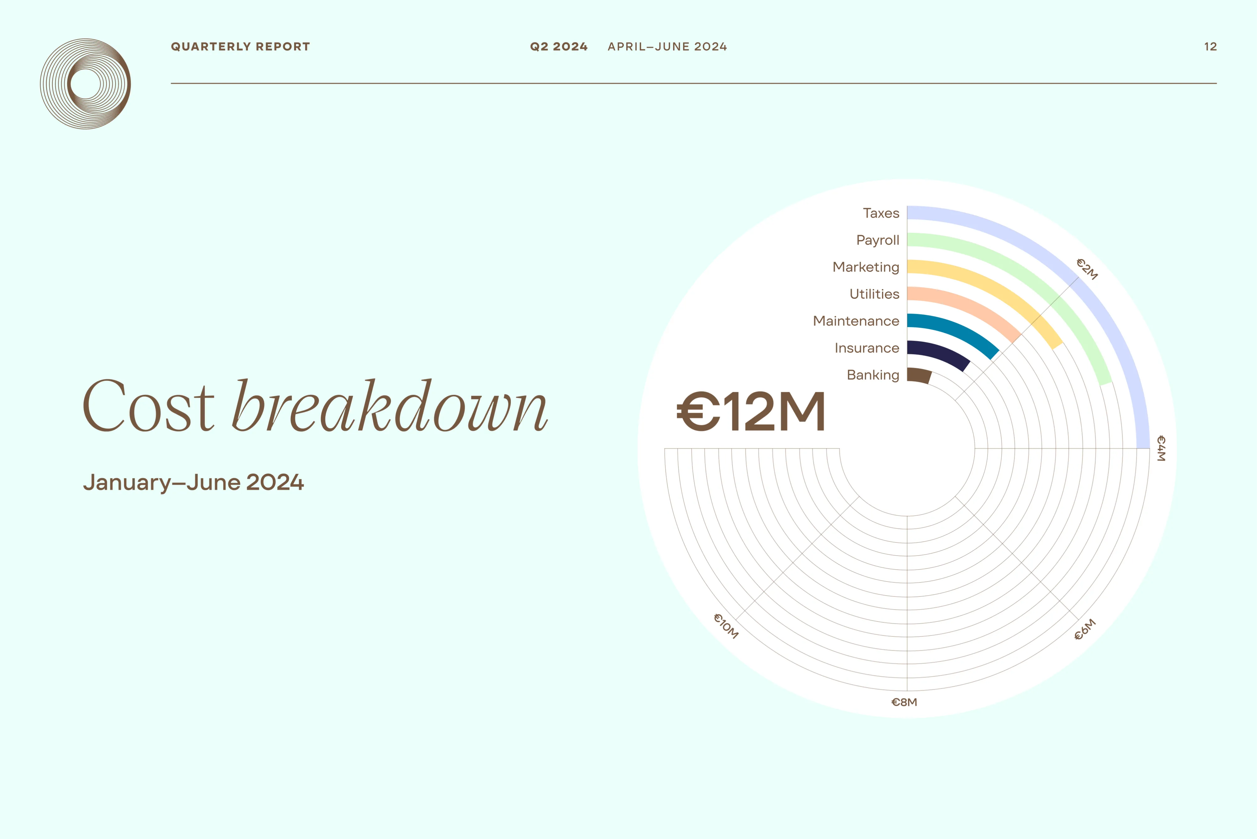
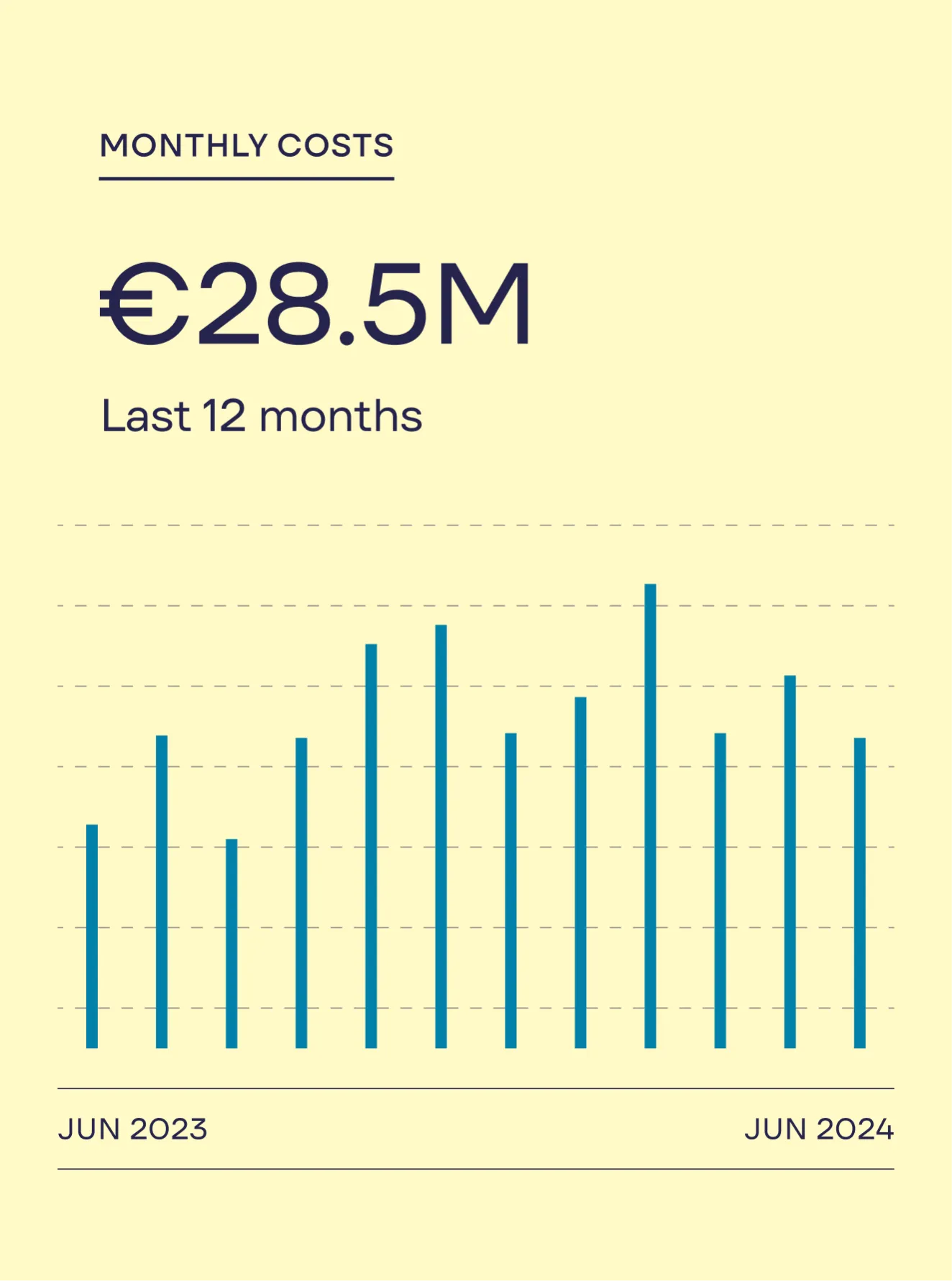
For typography, we selected a blend that balances elegance with practicality. The refined Victor Serif by Kometa conveys sophistication, while the versatile TT Firs Text by Type Type Foundry complements it as a practical choice, especially for data visualisations.