Rising Stars An identity for parents and children alike

Rising stars animation screenshot logo

Brief

The local childcare market has grown significantly in recent years, with some brands expanding into chains across multiple locations. However, many of these brands have adopted visual identities that tend to blend into each other, lacking a distinctive, memorable appeal and only addressing children as an audience. Recognising this gap, we aimed to create a unique visual identity that resonates with both key audiences: the children and the decision-making parents.

The name Rising Stars evokes a sense of excitement, positivity, and ambition, appealing to parents’ hopes for their children’s growth and development. We understood early on that while a childcare centre caters to kids, it’s ultimately the parents who need to feel a connection to the brand as well.

Services

  • creative direction

  • visual identity

  • positioning

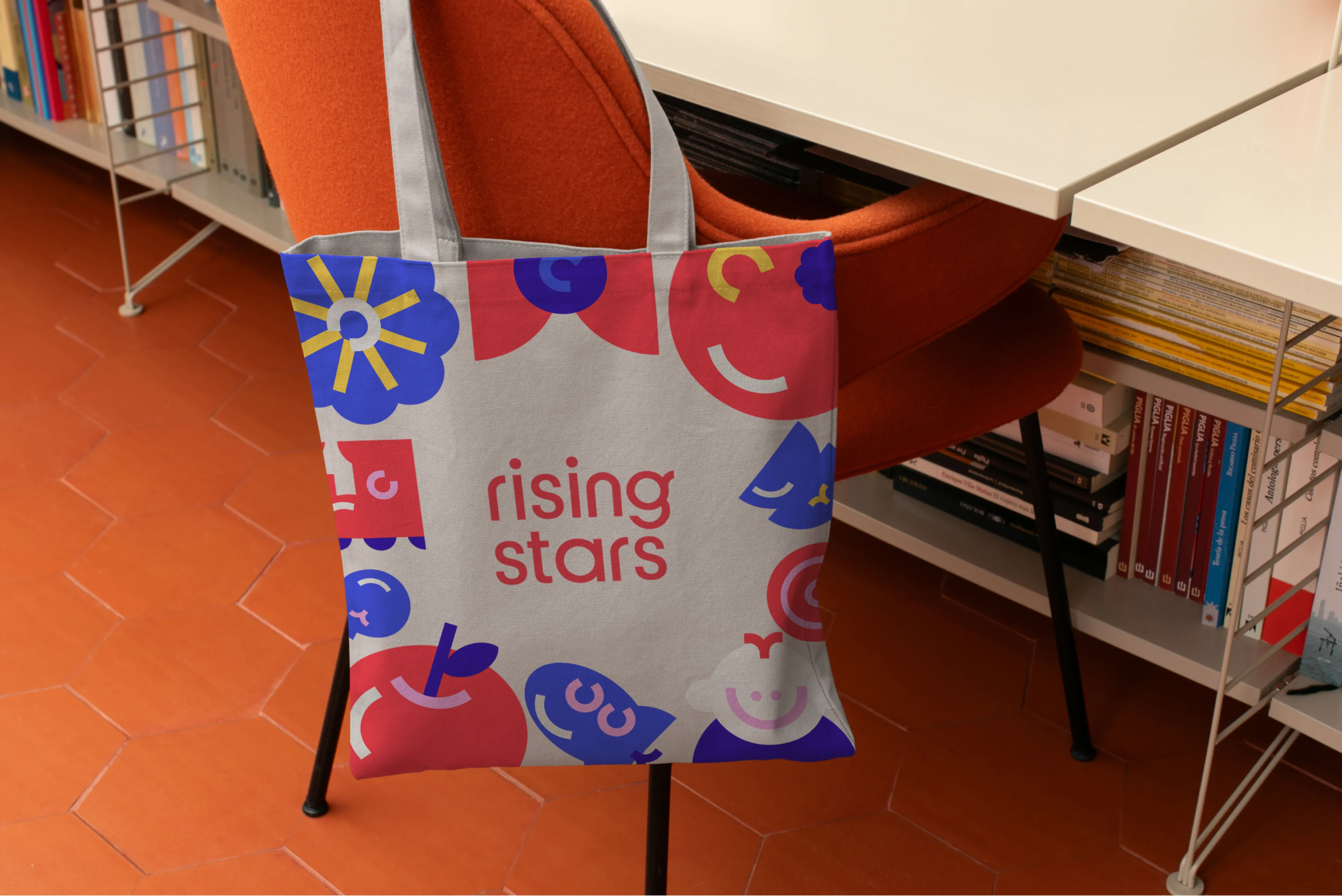
02 childcare centre branding tote bag
03 childcare centre branding logo customisation
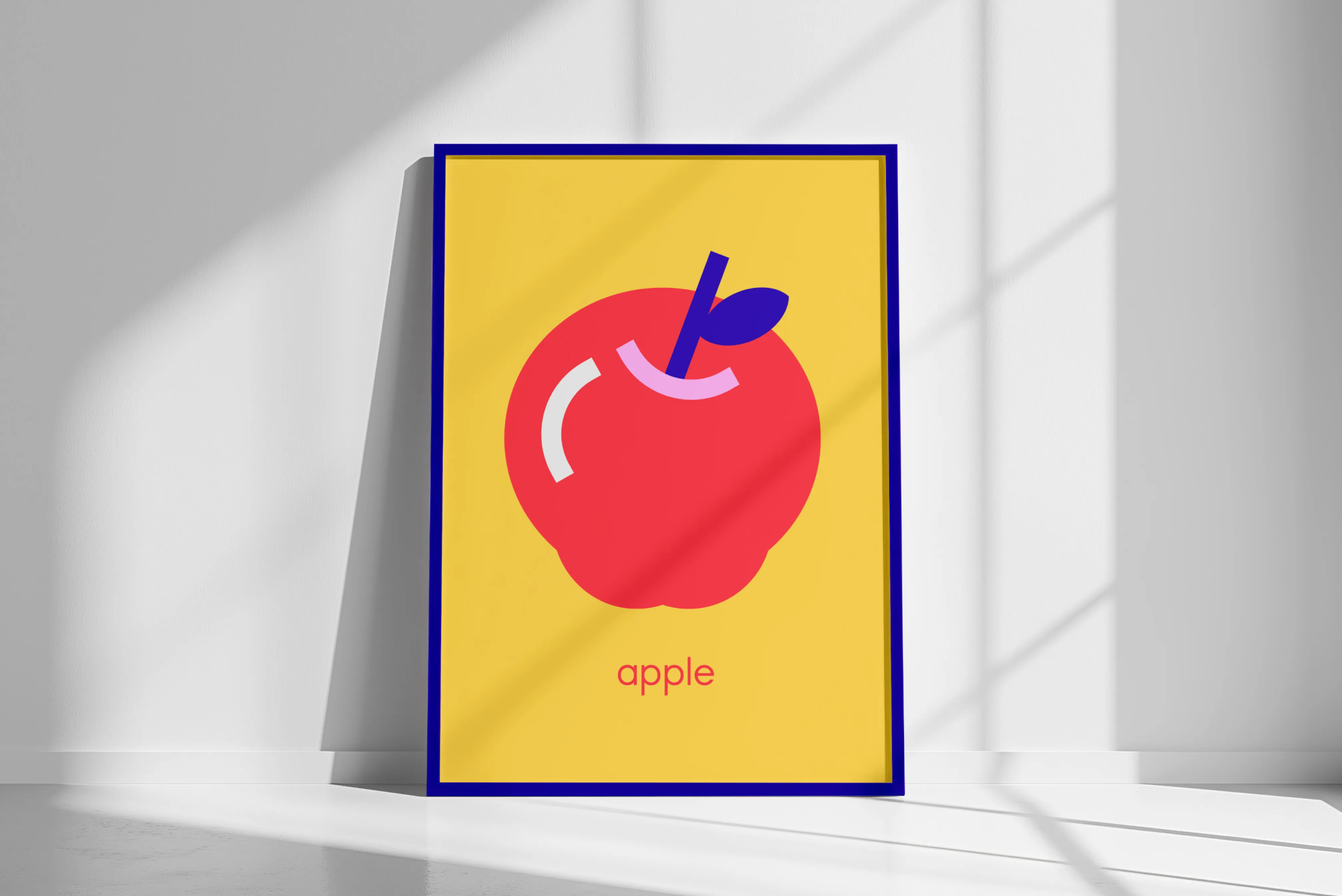
04 childcare centre branding print

APPROACH

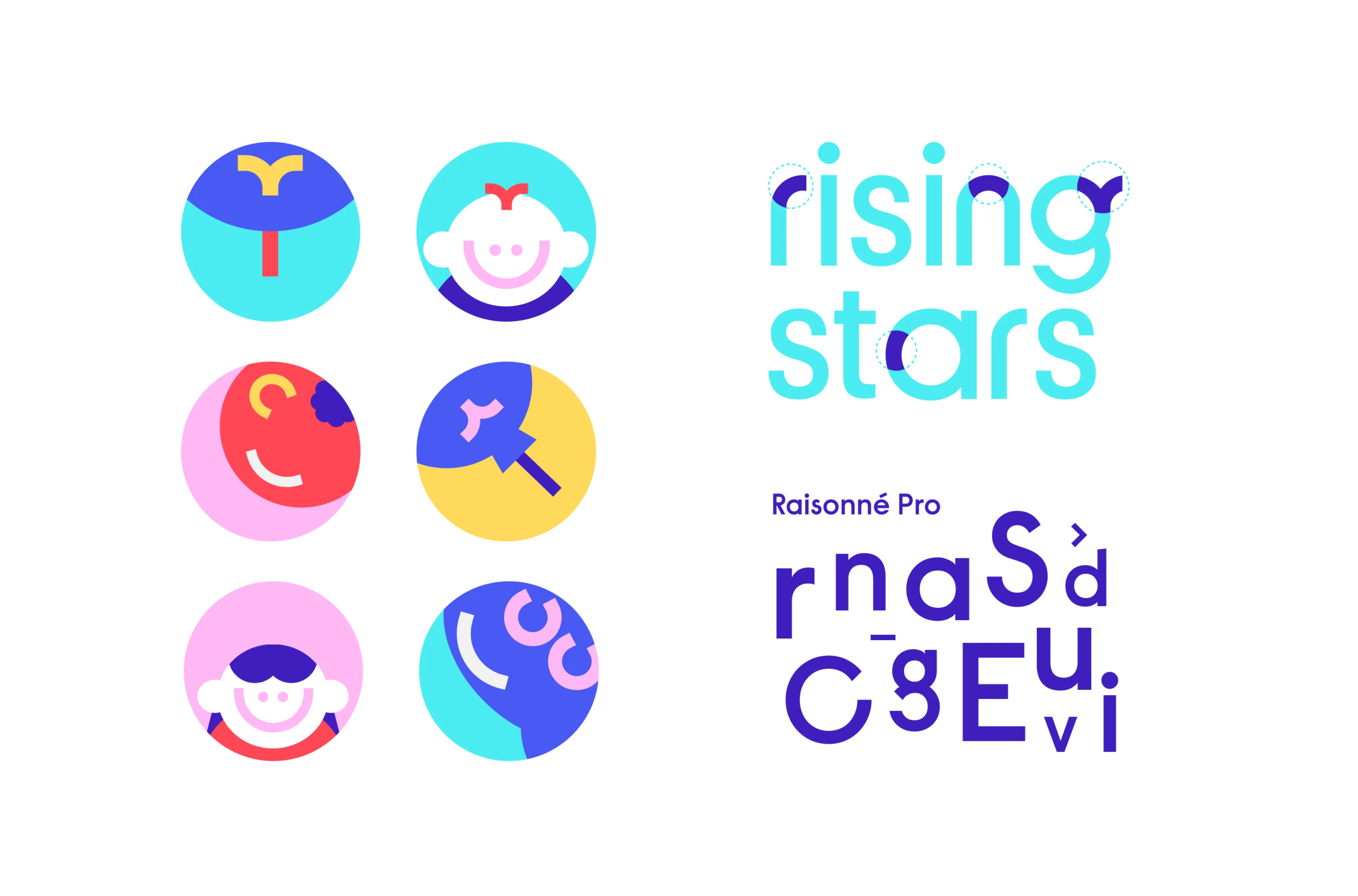
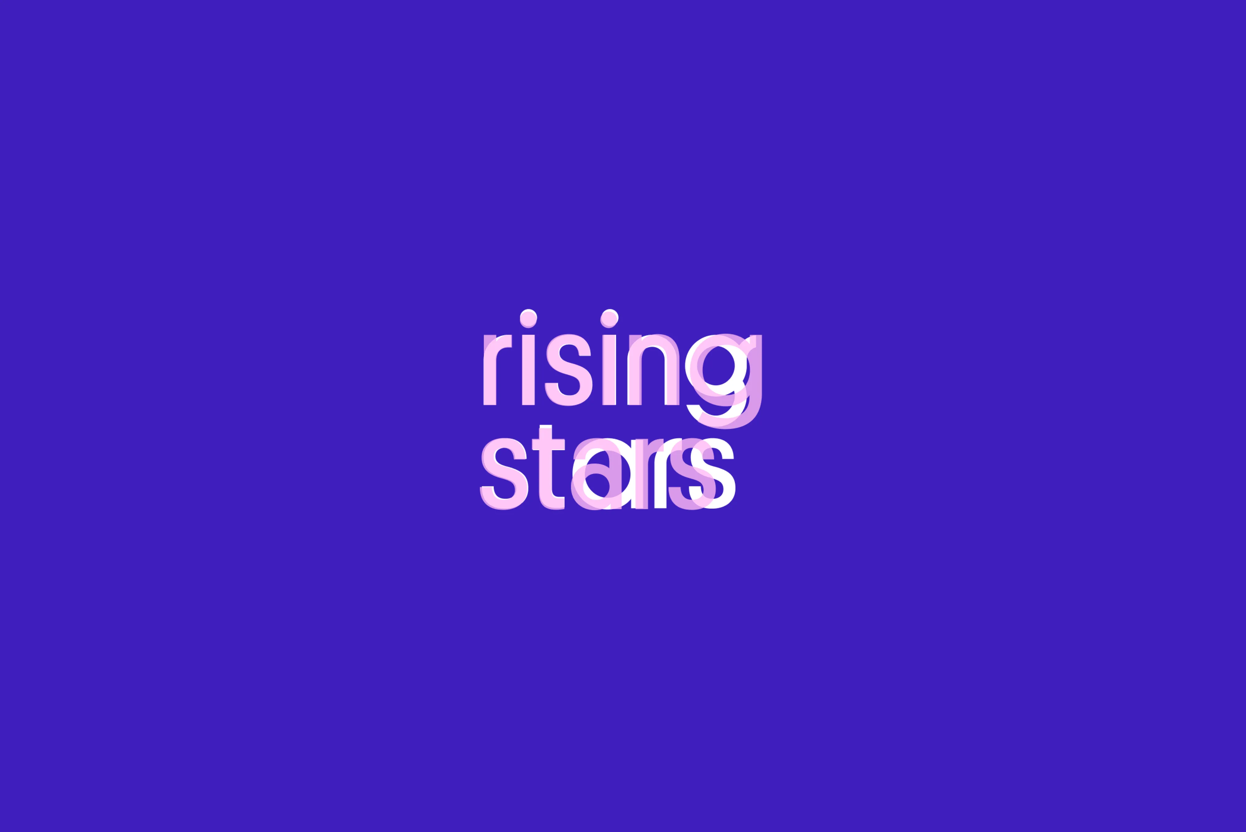
For the Rising Stars wordmark, we adapted Platform by Commercial Type. Varying character widths available in Platform introduce unexpected touches, adding a sense of playfulness and surprise—we emphasised this through modifications to the letters r, n, g and a.

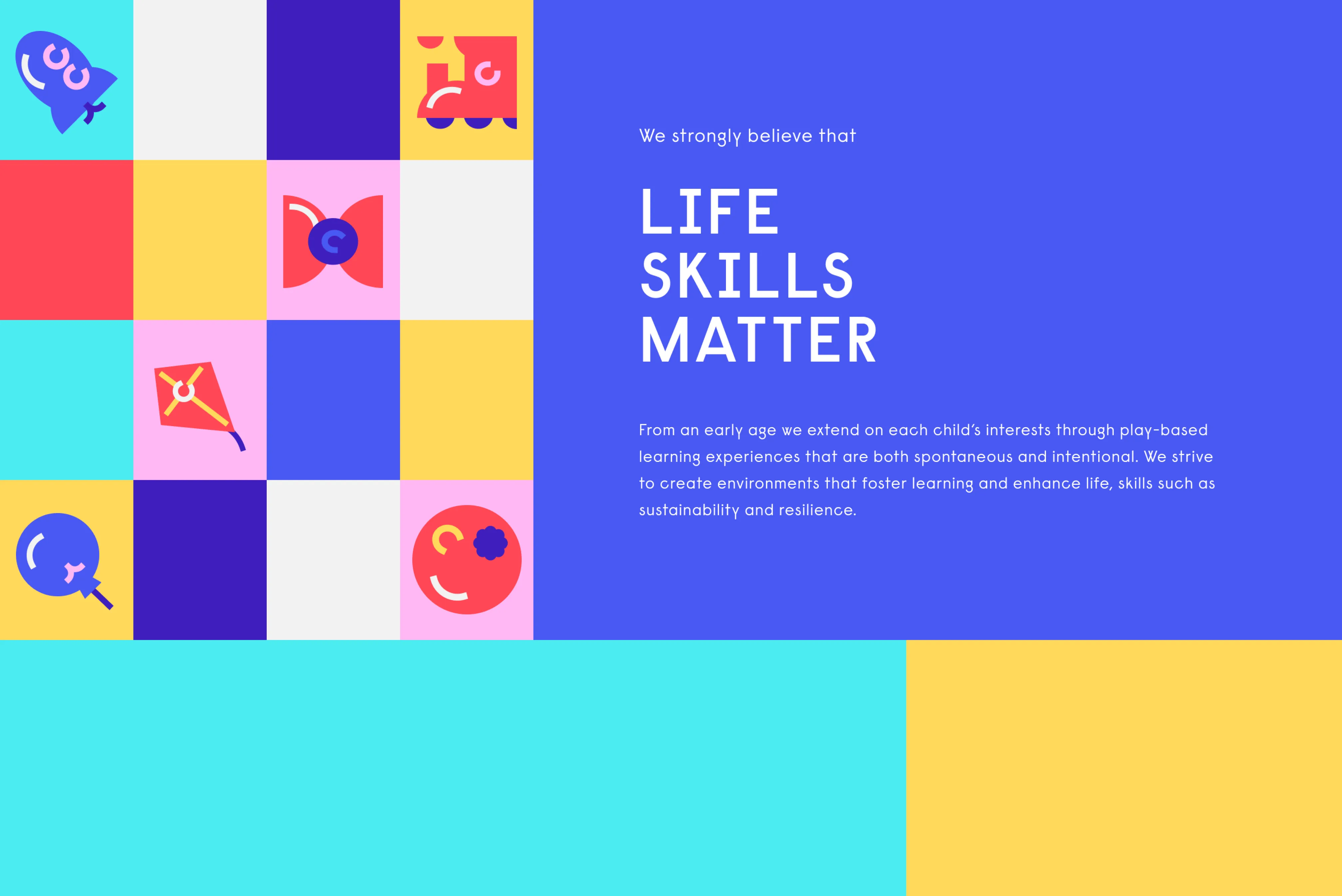
We chose Raisonné Pro by Colophon Foundry as the primary typeface for its clean, geometric structure combined with subtle, quirky details. This typeface strikes a perfect balance between playfulness and professionalism, making it ideal for communicating with both children and parents. It’s engaging without feeling overly childlike, while remaining approachable and legible.

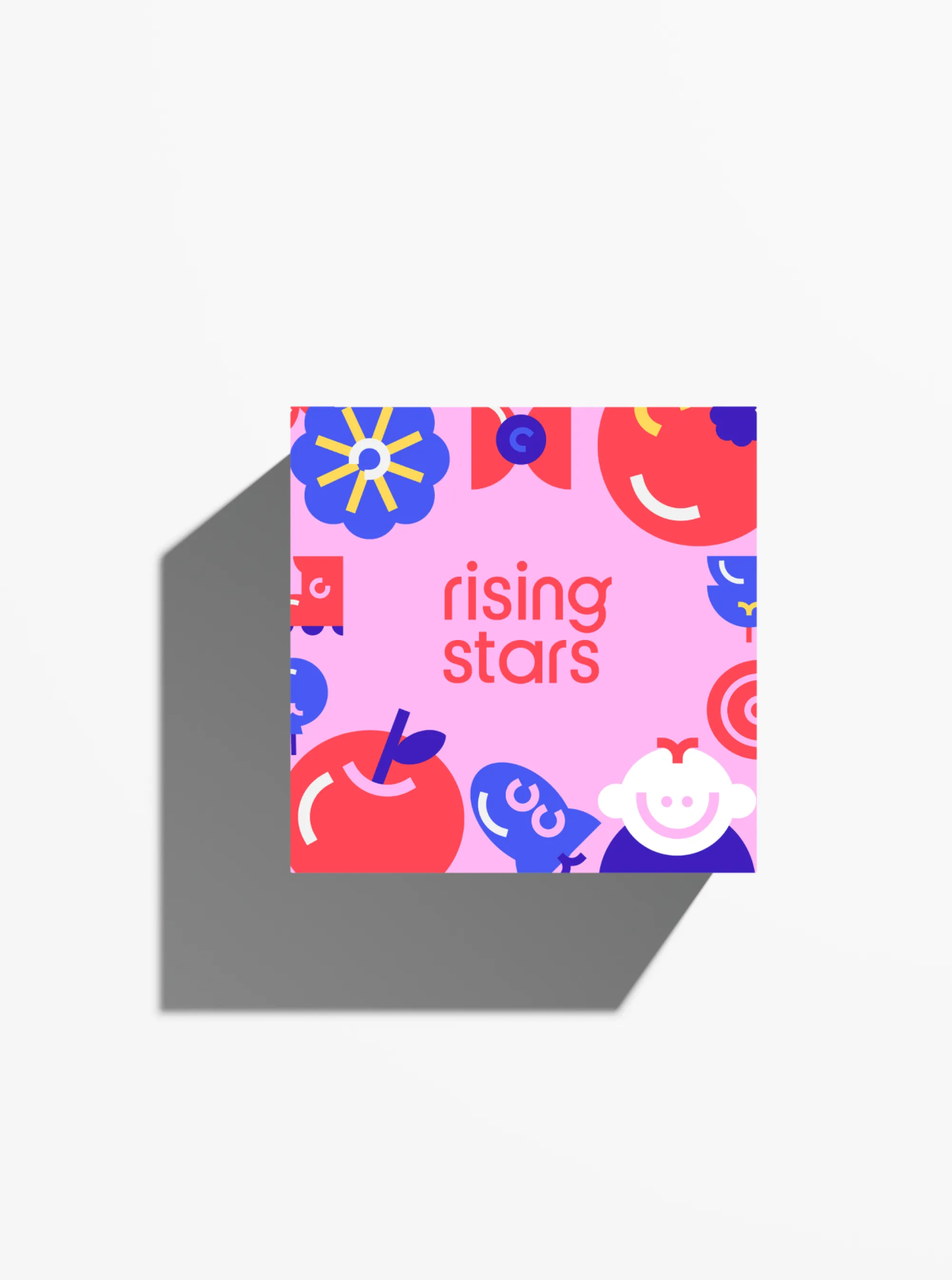
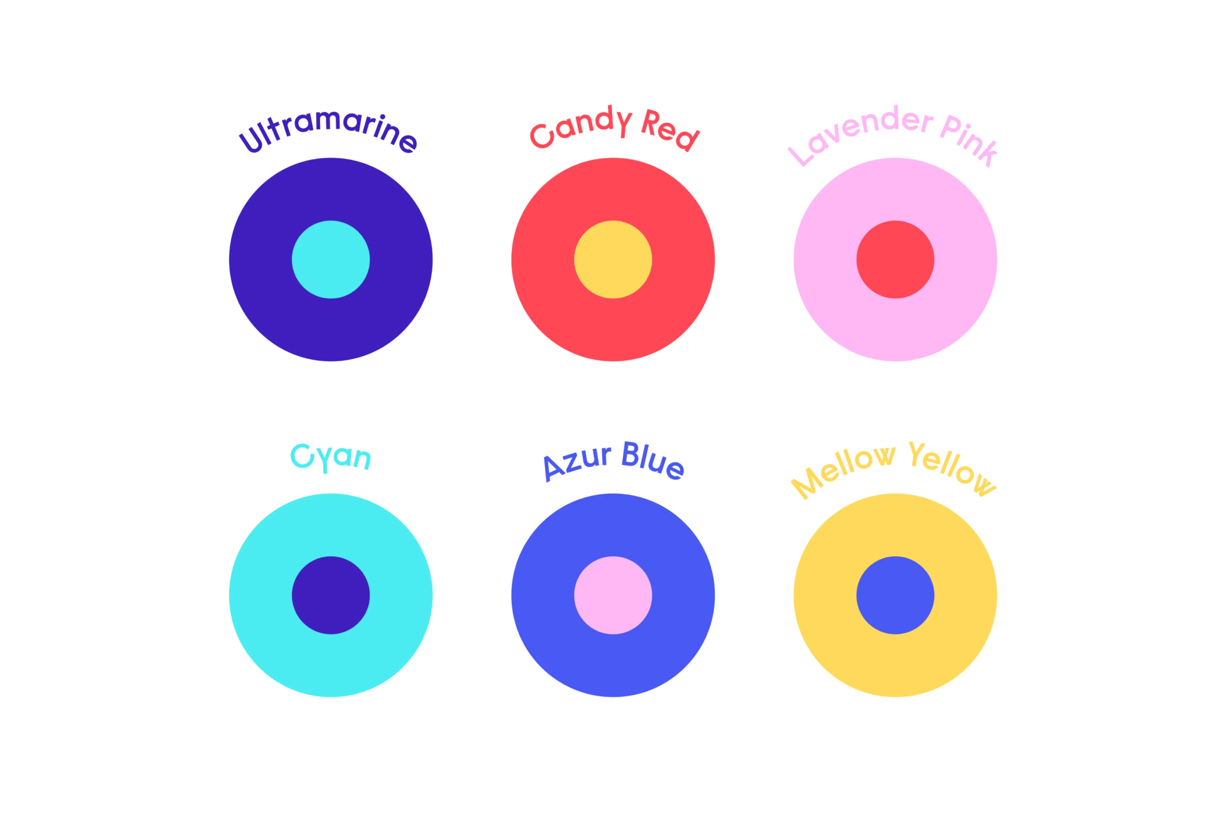
The illustrations follow a bold colour palette and are composed of simple geometric shapes, with added details drawn from the logo and supporting typography to ensure a cohesive visual language. The modular approach to the illustrations allows for flexibility, enabling the creation of diverse scenes from a small set of core elements.
06 childcare centre branding typography
05 childcare centre branding stickers
Rising stars animation screenshot icons
08 childcare centre branding packaging
09 childcare centre branding icons illustrations
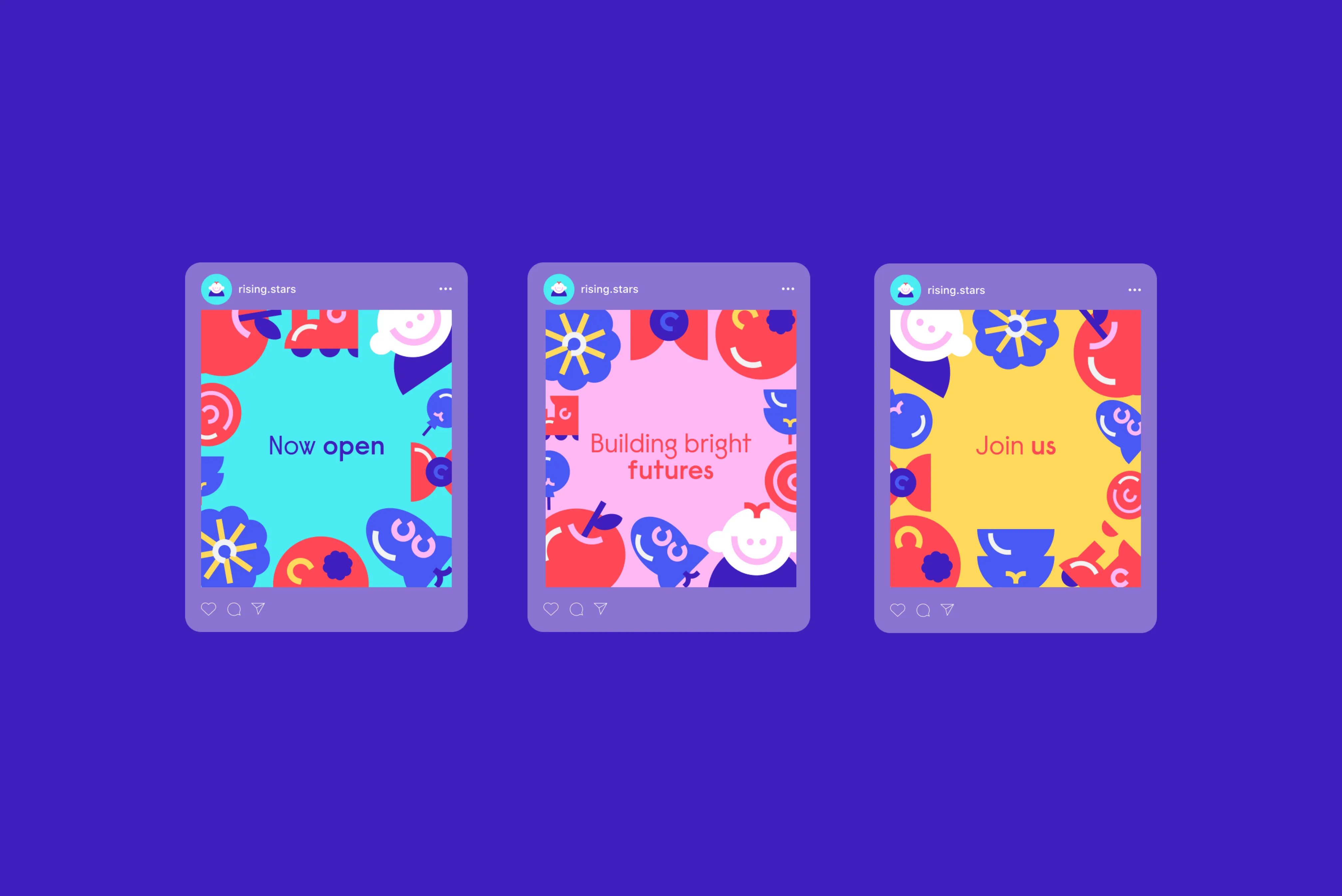
10 childcare centre branding social media posts
Rising stars animation screenshot typography

OUTCOME

The final brand identity captures the dynamic, nurturing environment of Rising Stars, presenting a warm, distinctive face to parents while inviting children to engage and explore. The combination of vibrant colours, adaptable illustrations, and a balanced typographic style creates a memorable experience that stands apart in the childcare market, making Rising Stars both approachable and truly unique.

12 childcare centre branding colour palette
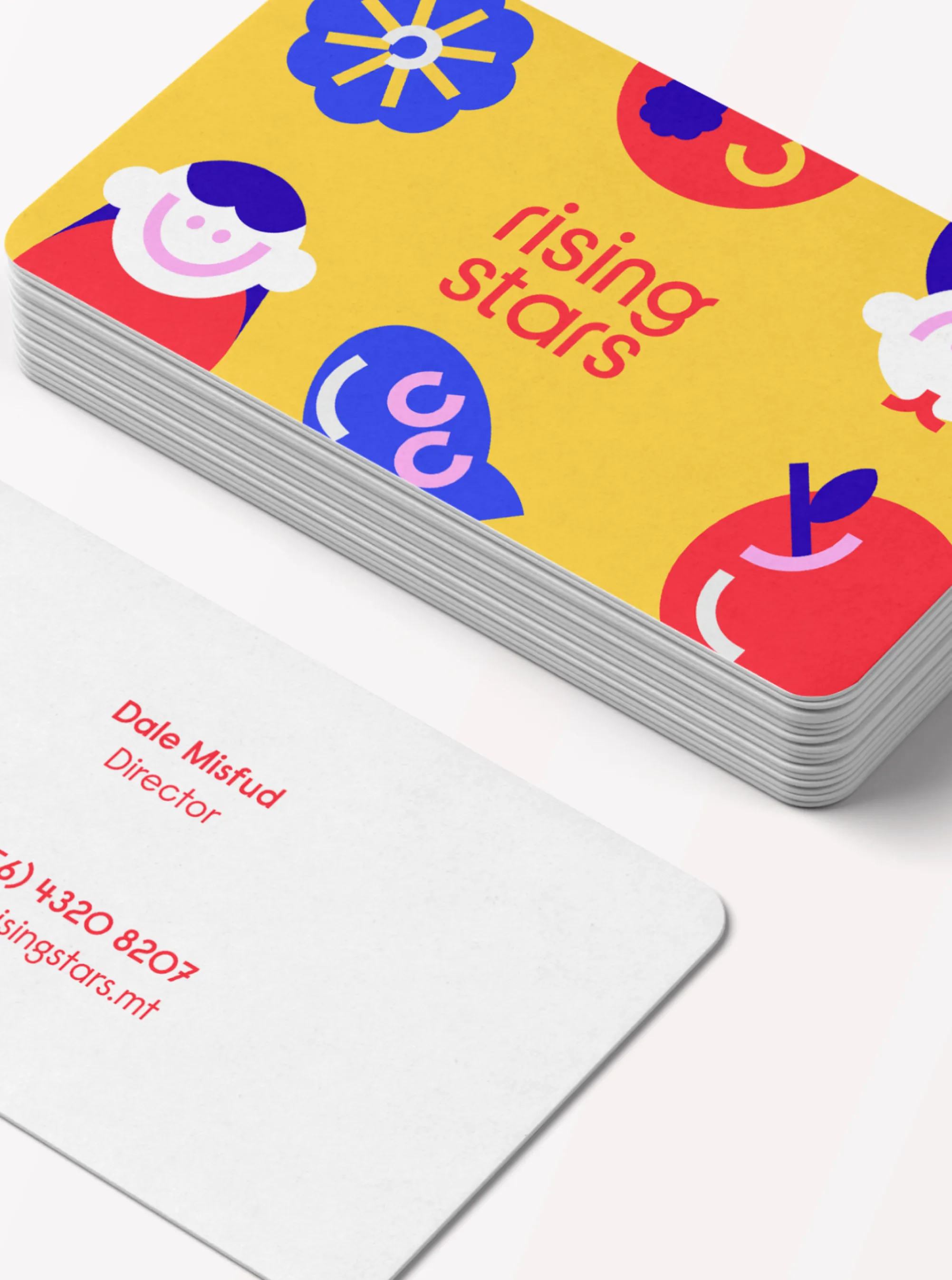
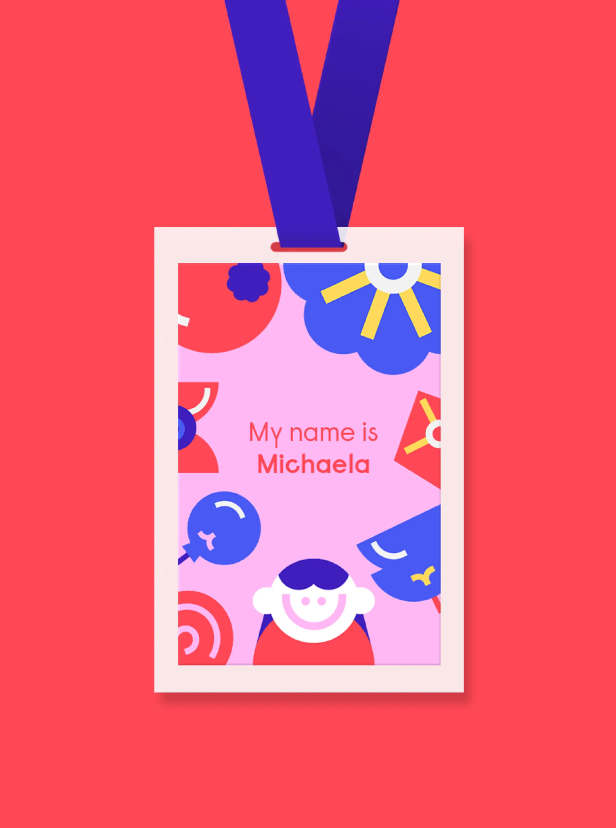
13 childcare centre branding business cards 14 childcare centre branding id card
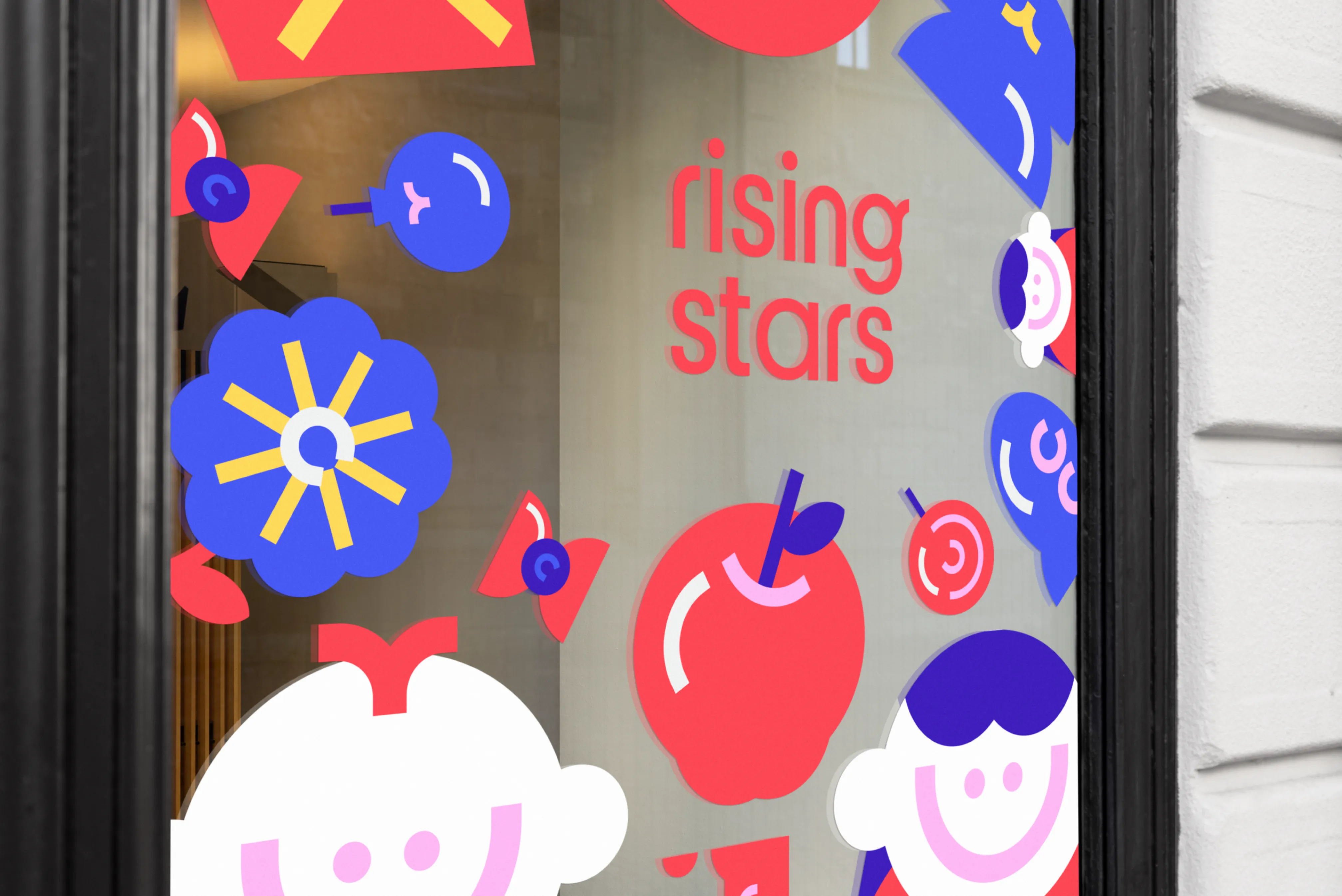
15 childcare centre branding signage

Next Project

Portico

PorticoNaming and identity for a boutique hotel in Mosta


Starting a new project and think we’re the right fit?

Let’s talk

Subscribe to our newsletter

Subscribe