
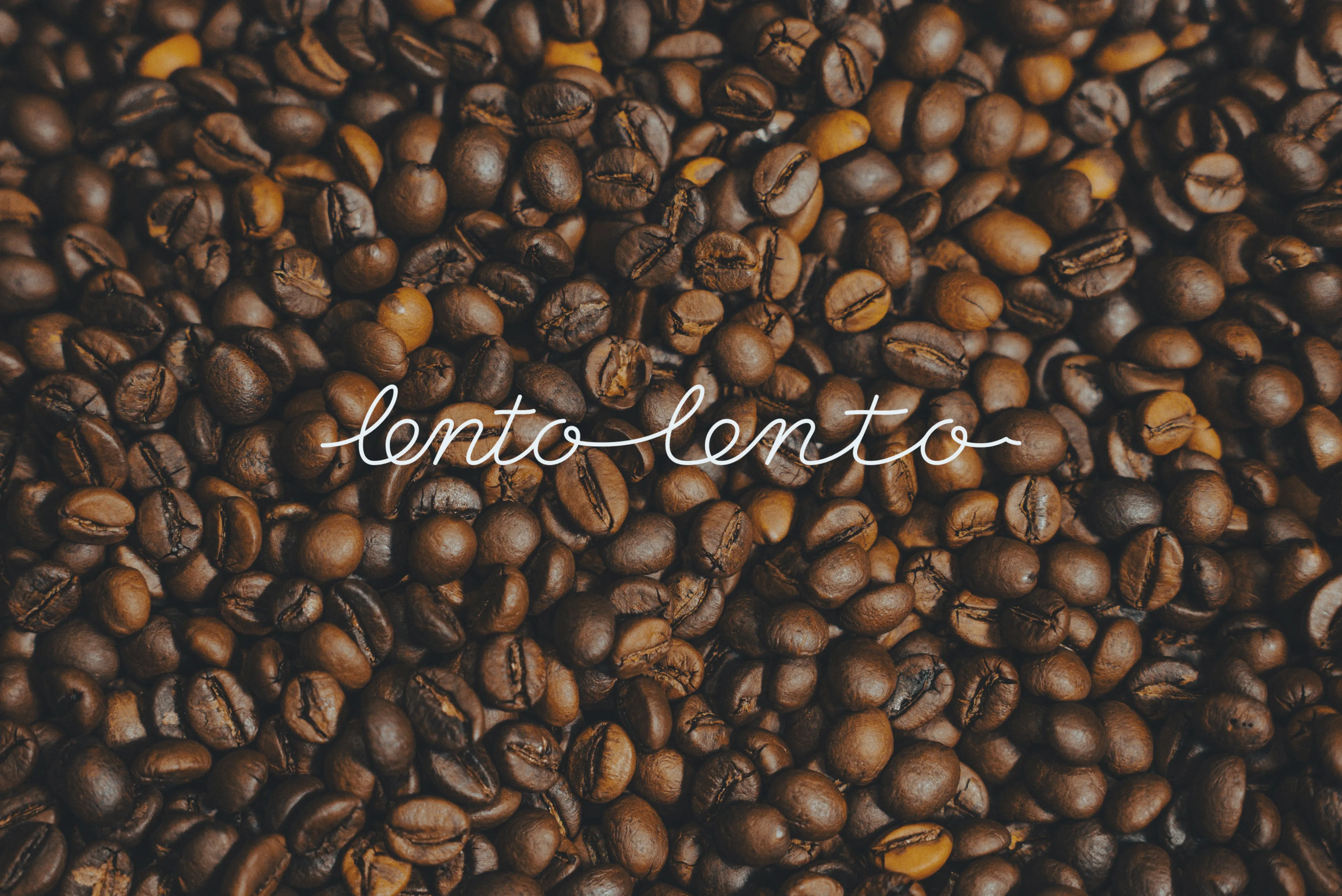
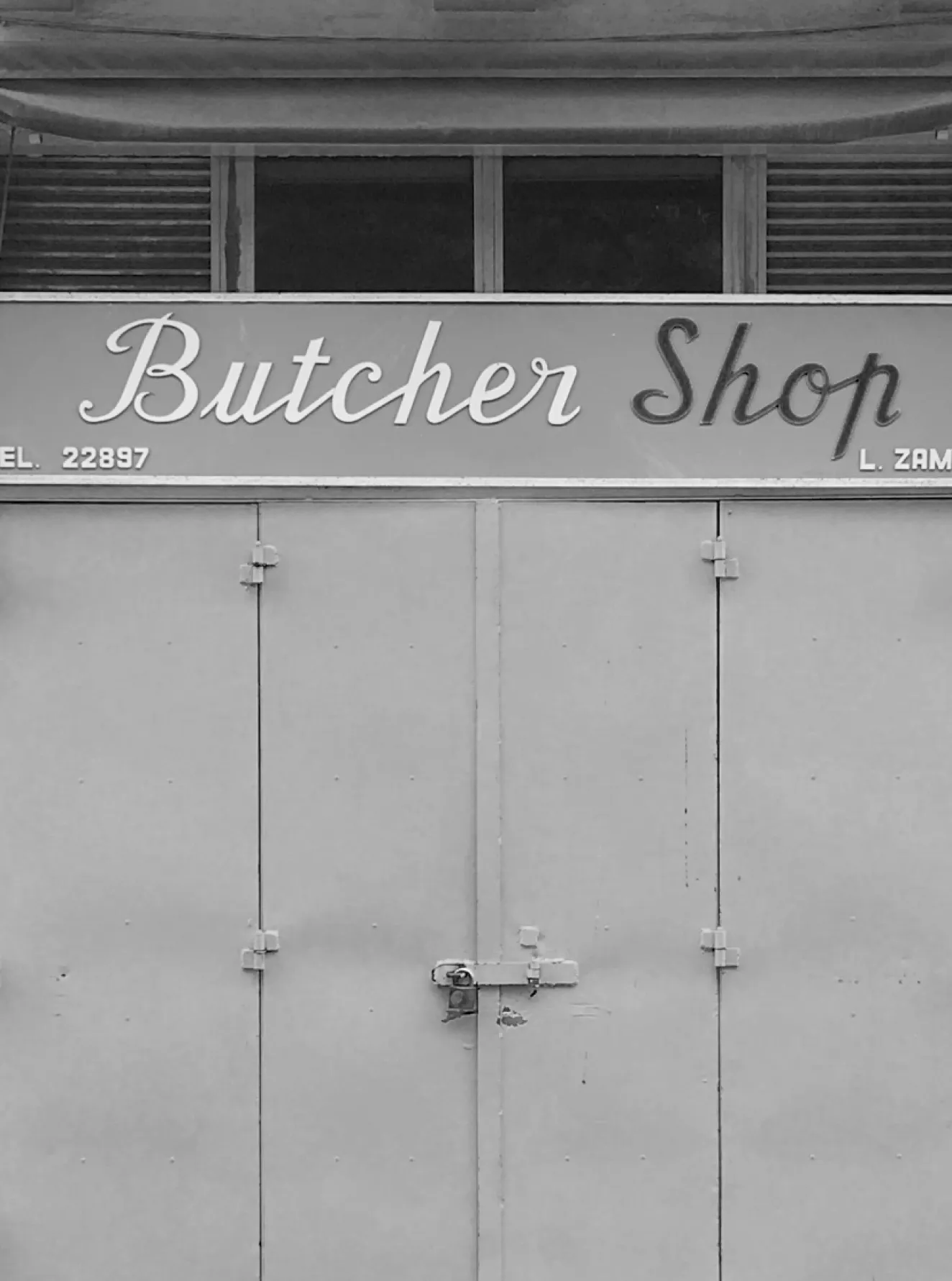
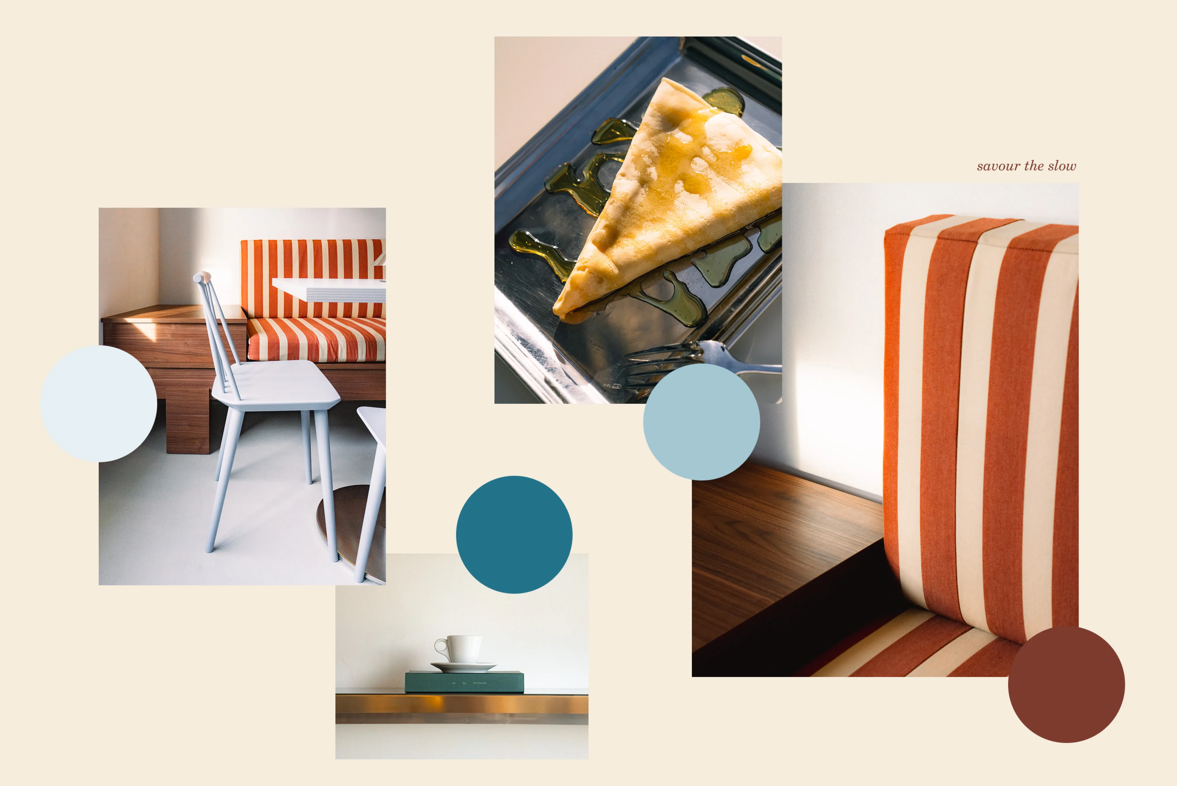
We proposed the name Lento Lento — loosely translated from Italian as slowly slowly — as a reminder that coffee is not just a morning chore but a ritual that deserves its time to be truly appreciated. The repetition of lento emphasises tempo, lending rhythm to the name. With a vintage Italian coffeehouse aesthetic and an established colour palette as our foundation, we crafted a narrative that celebrates the Mediterranean coffee lifestyle. Our research included studying imagery of Italian coffee shops to explore signage examples and printed materials from that era. And the question that guided the process was “how can we show slow movement in a static form?”
Lento Lento Savour the slow
Brief
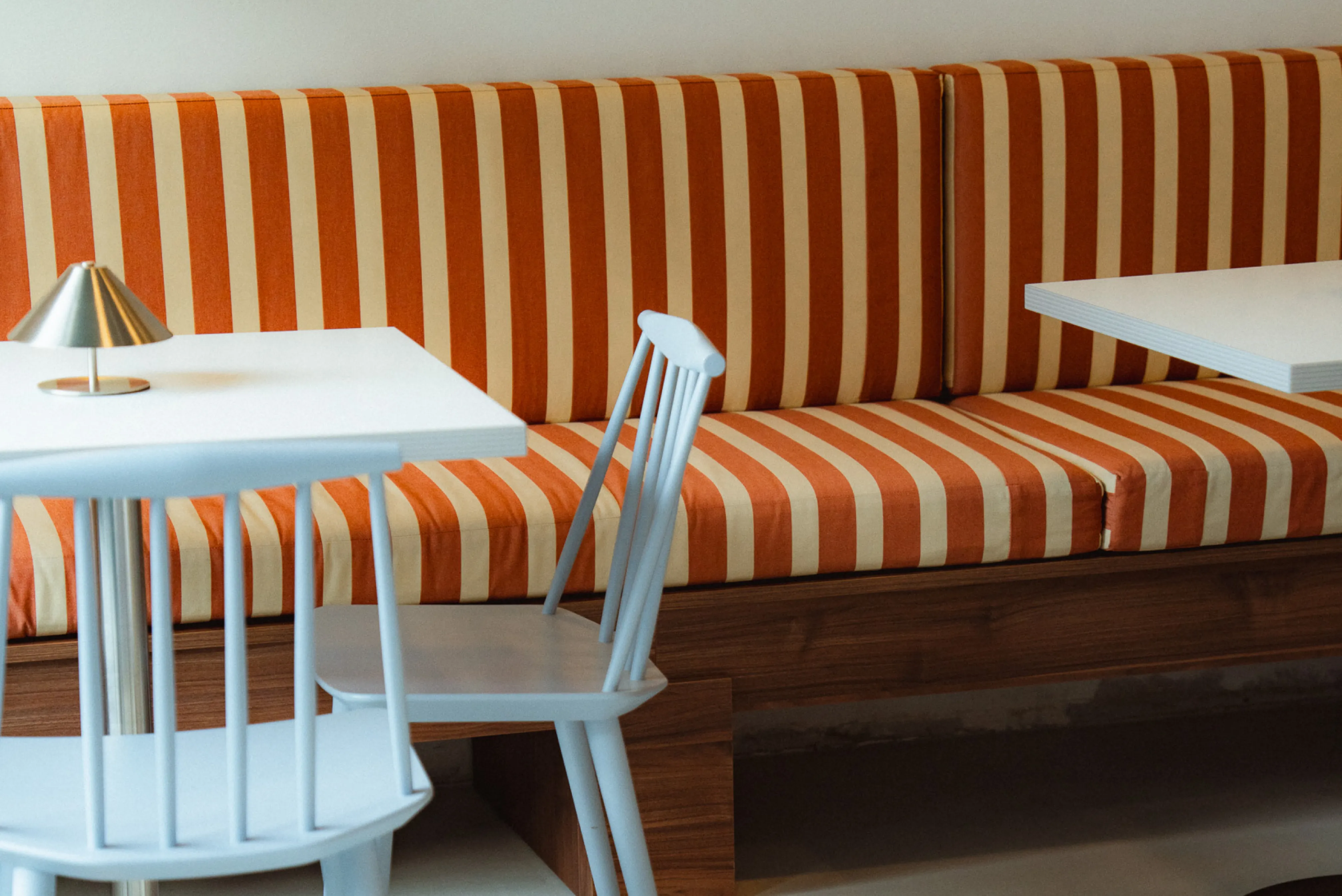
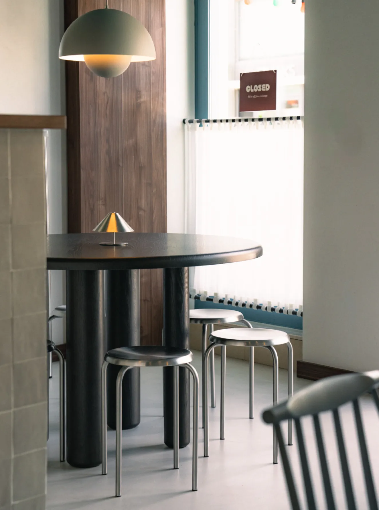
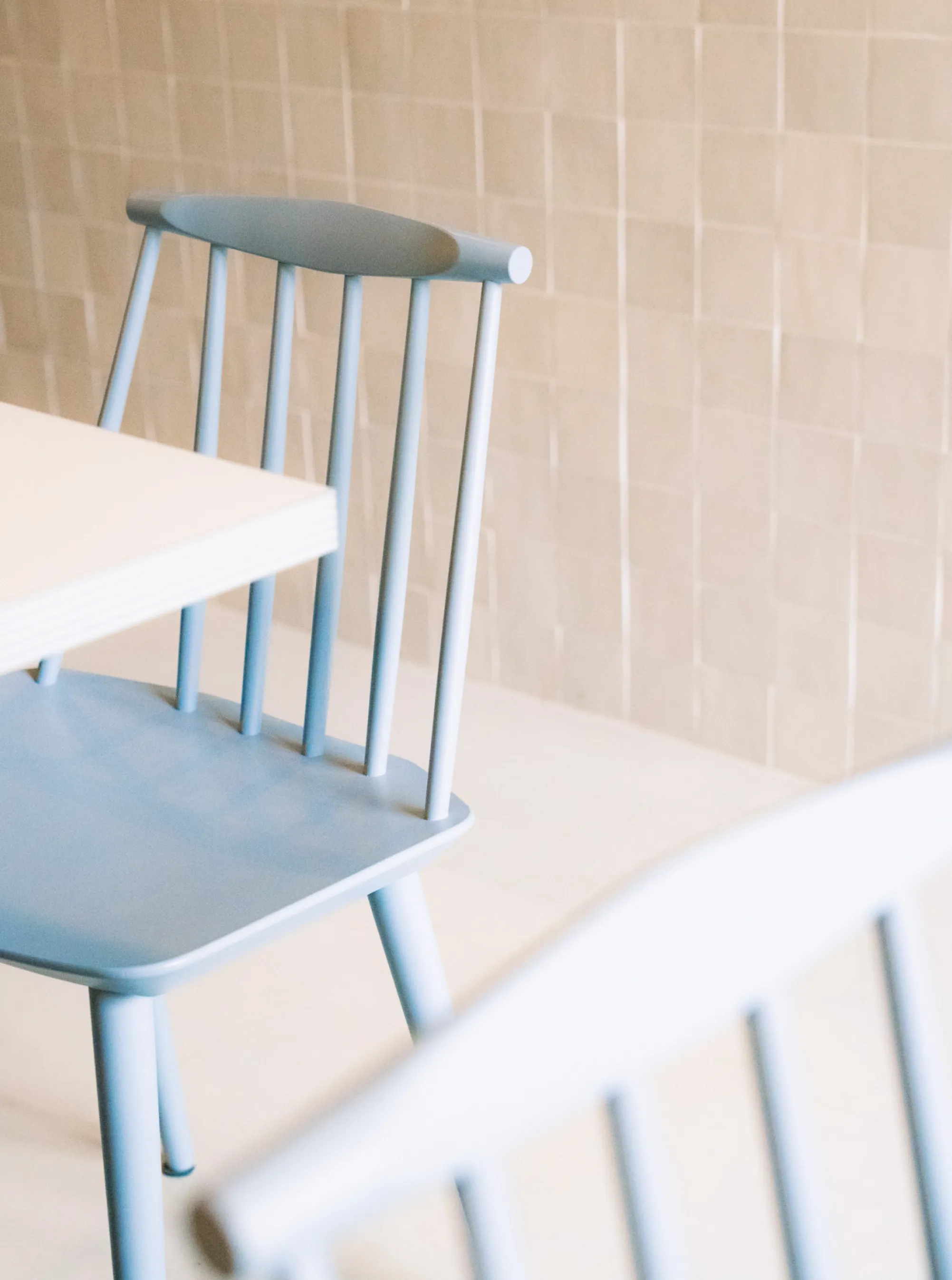
Lento Lento is a project introduced to us by an interior design studio that had already established a design direction for this new coffee shop. The interior concept drew inspiration from Italian and Maltese cafés of the 1950s and 60s, utilising similar materials and textures with a contemporary twist. The objective was to create a brand that is inspired by coffee shops of the era but distinctively contemporary at the same time.
Services
naming
Messaging
creative direction
collateral design
branding
brand strategy
positioning
Collaborators
-
R Studio: Interior
-
Black Salmon: Animation
-
Seventh Yard: Photography
Approach



Slowing down
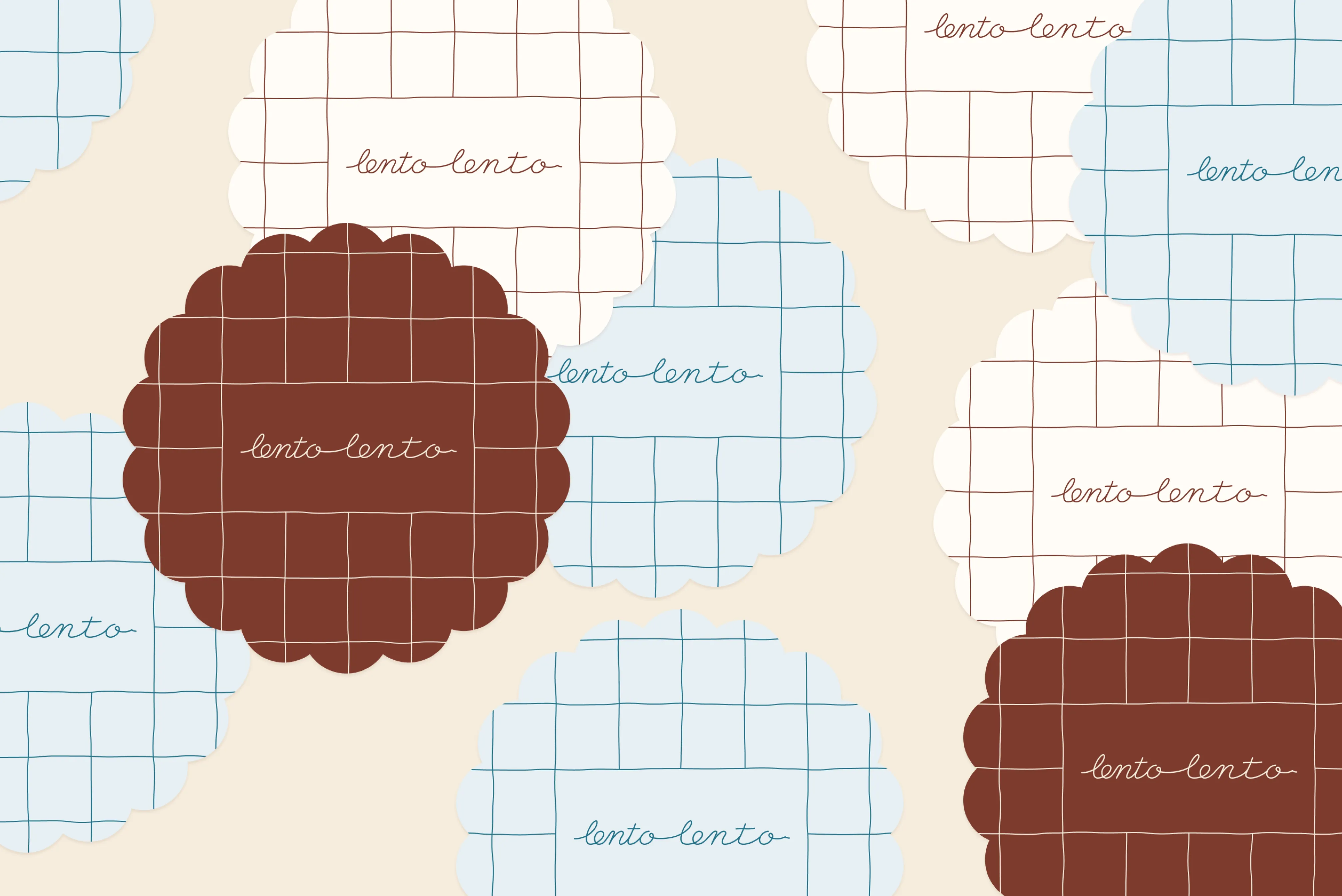
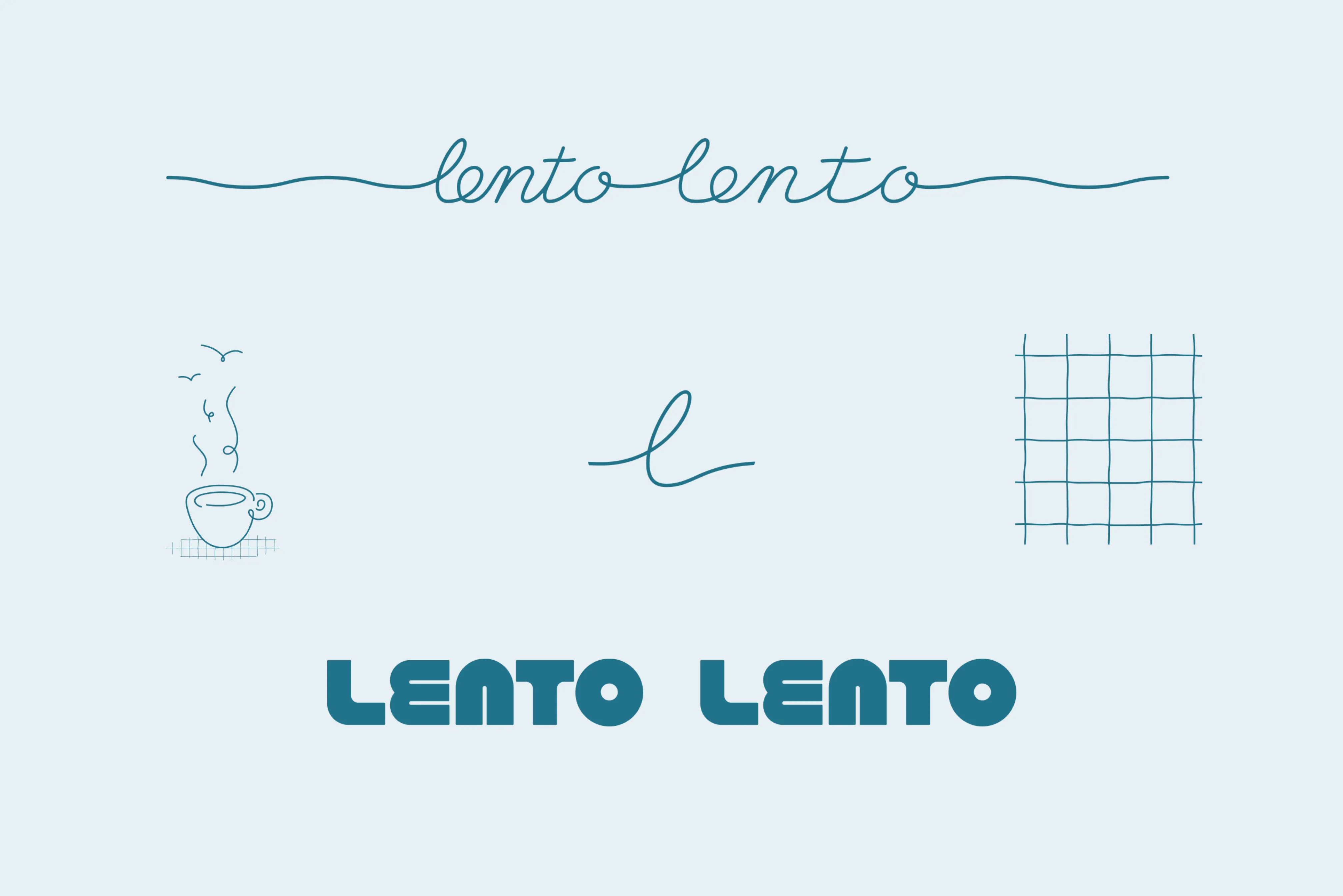
A custom logotype was designed to give a sense of slowing down with spacing between letters gradually increasing as you read from left to right.

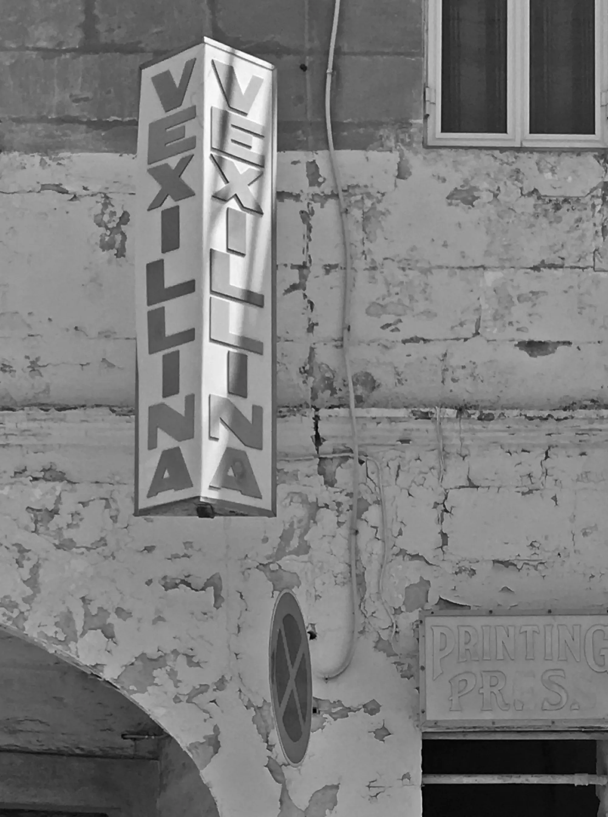
Signage type
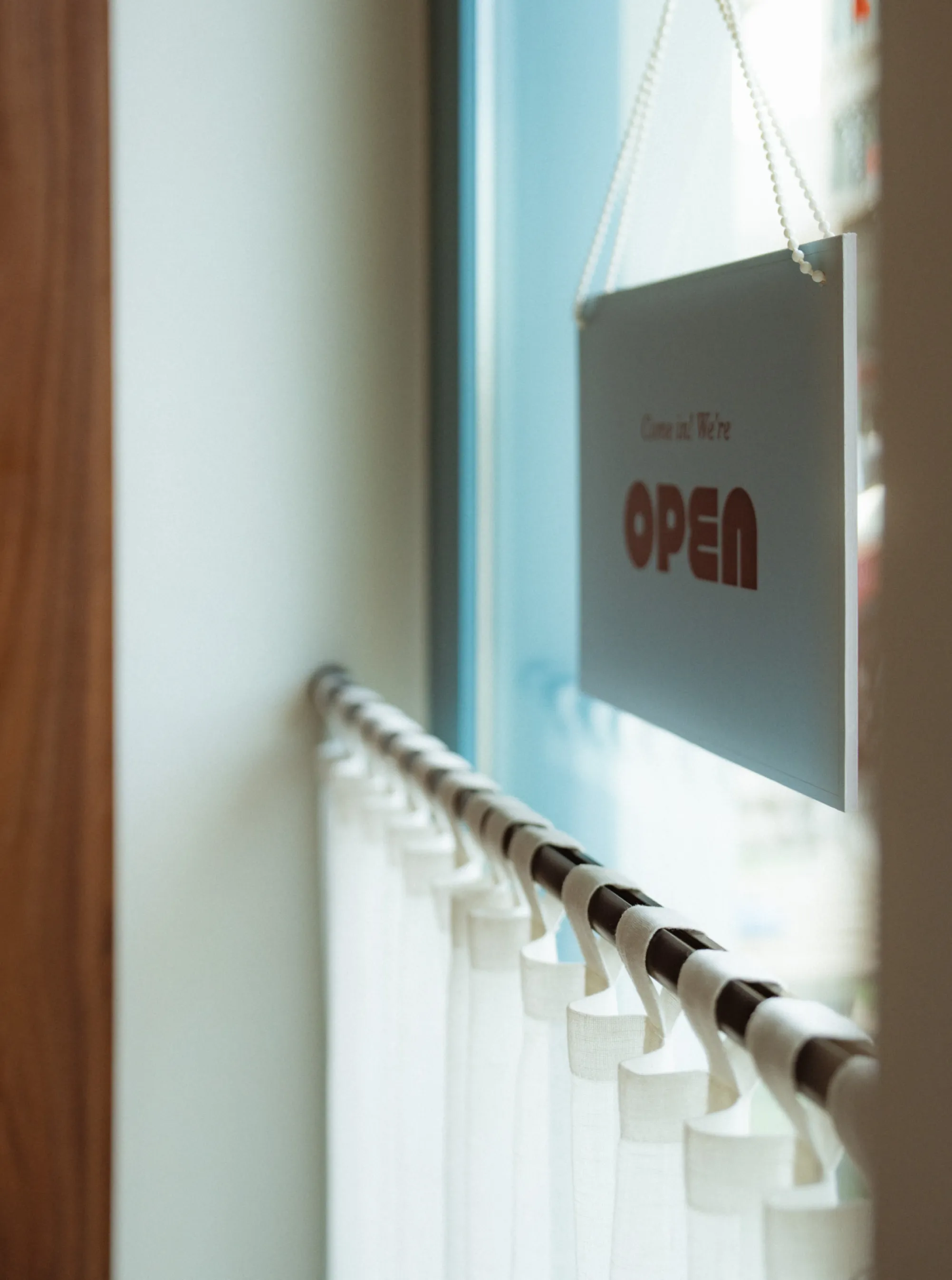
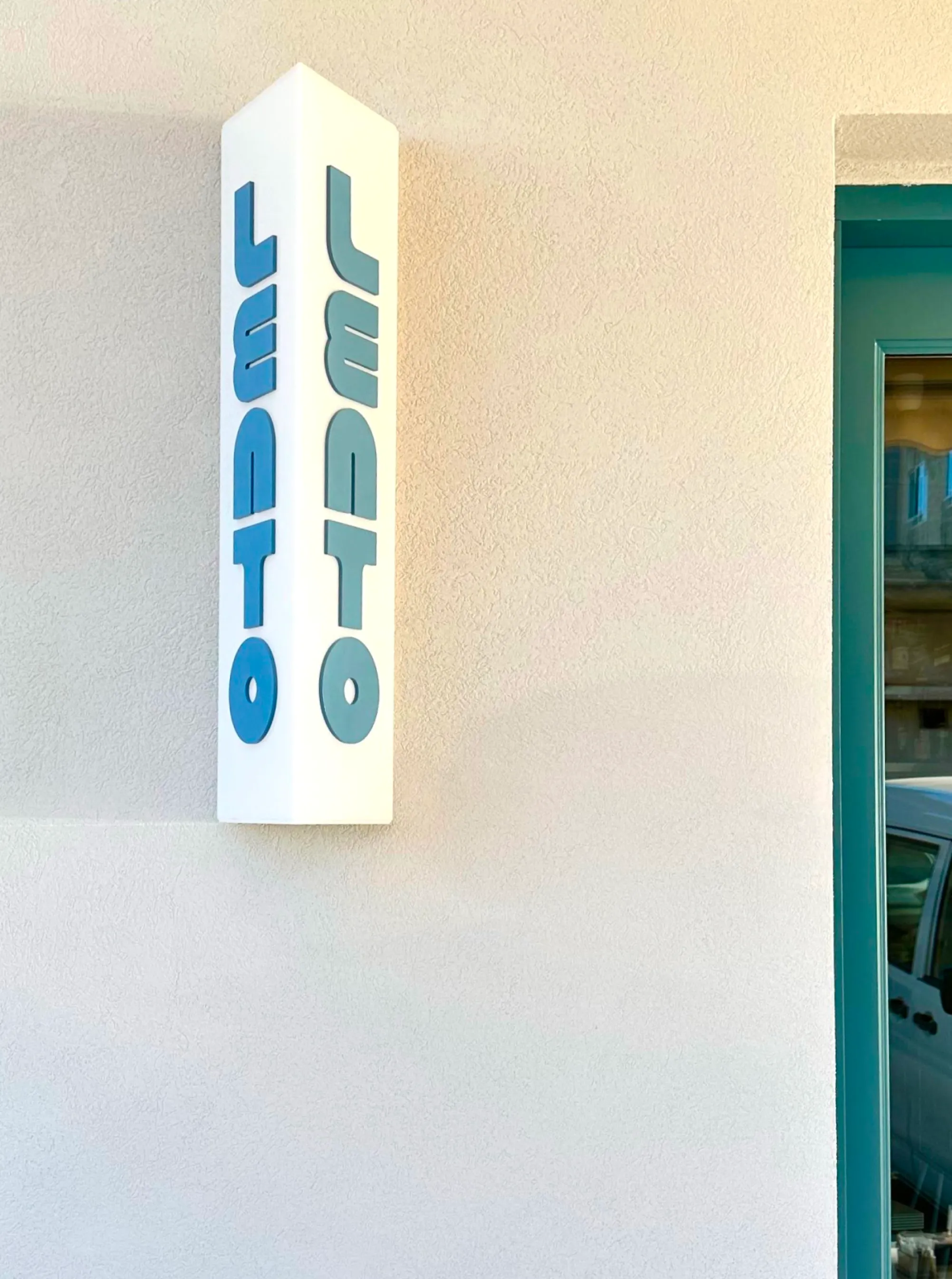
It’s still common to see cafés with differently styled signage hanging on their facade and this gave us the opportunity to design letterforms that were inspired by the interior but could perfectly fit a 1980s acrylic signage.
Outcome
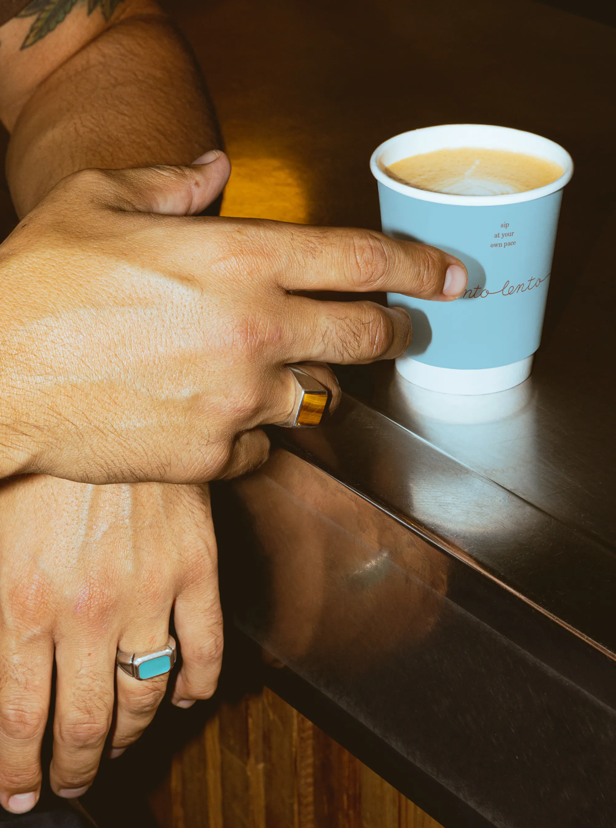
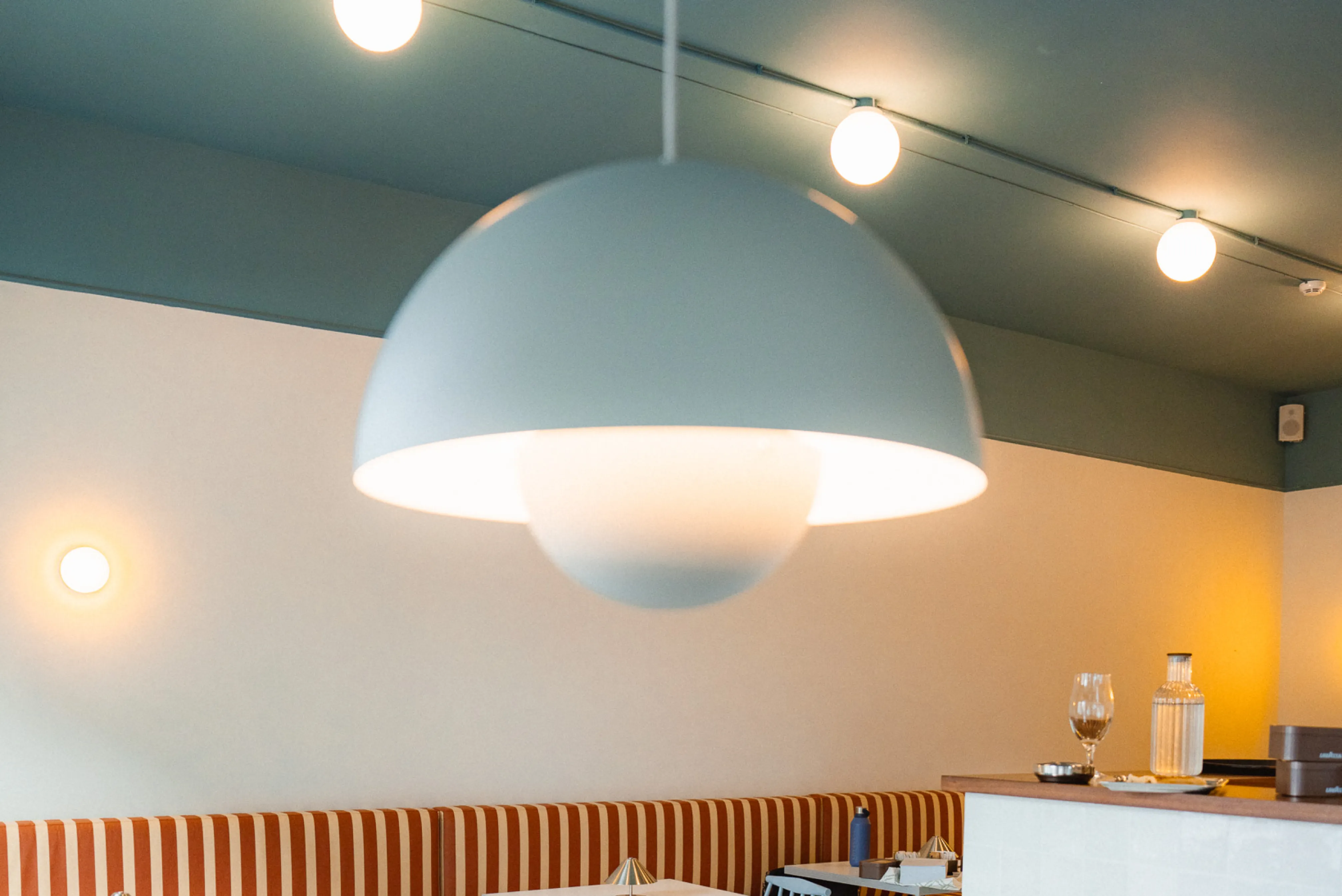
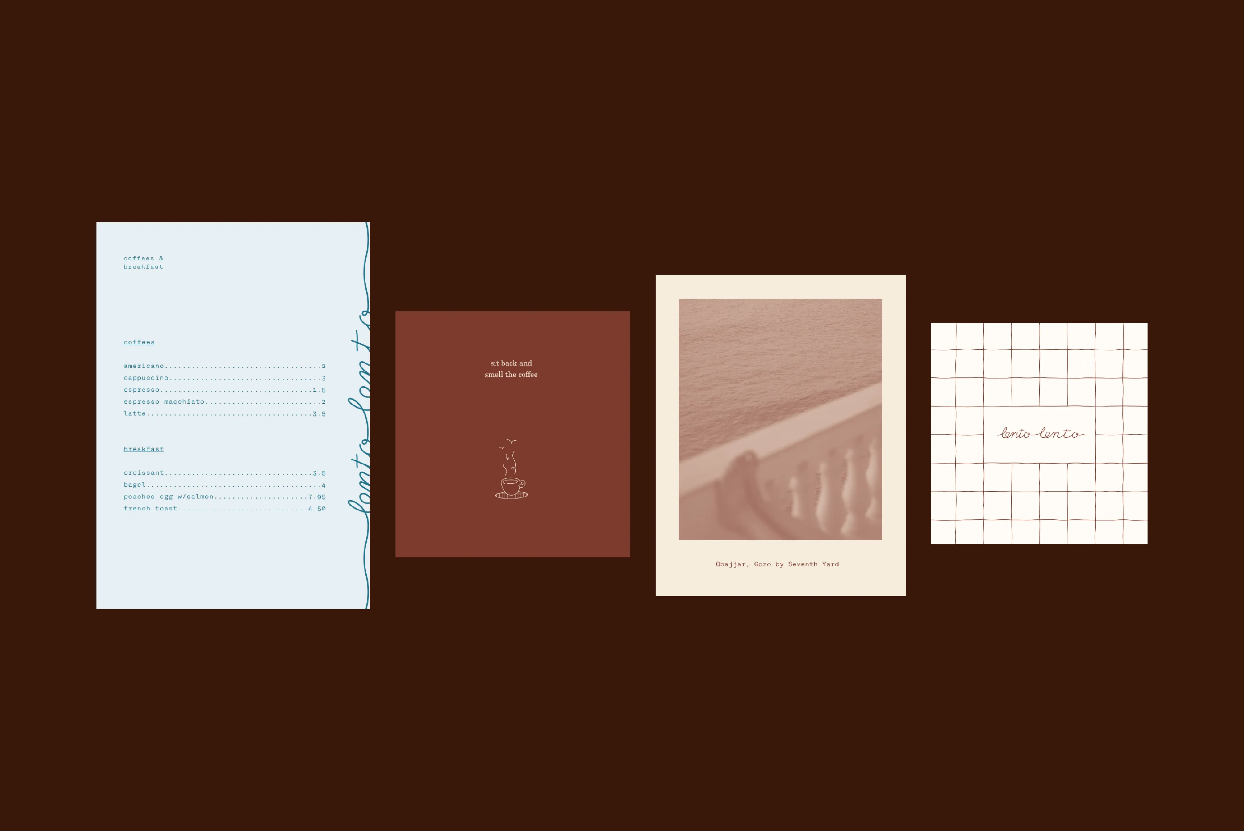
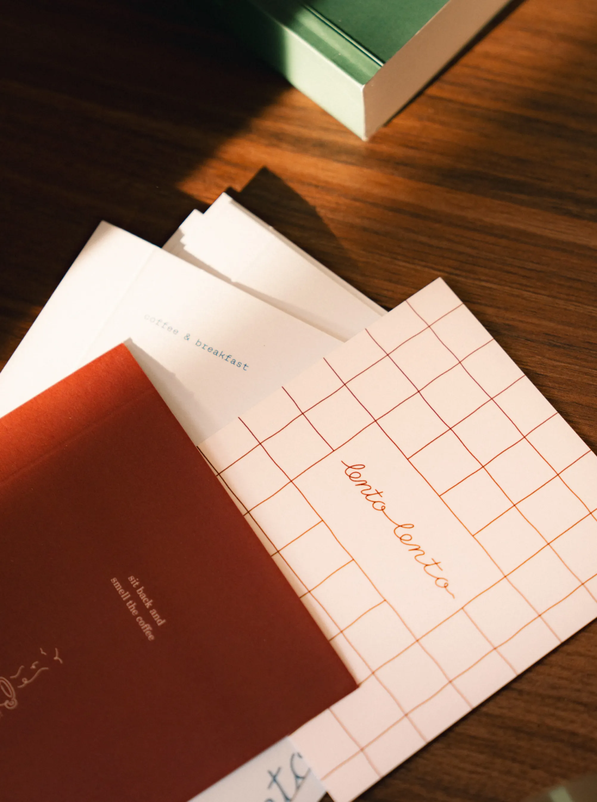
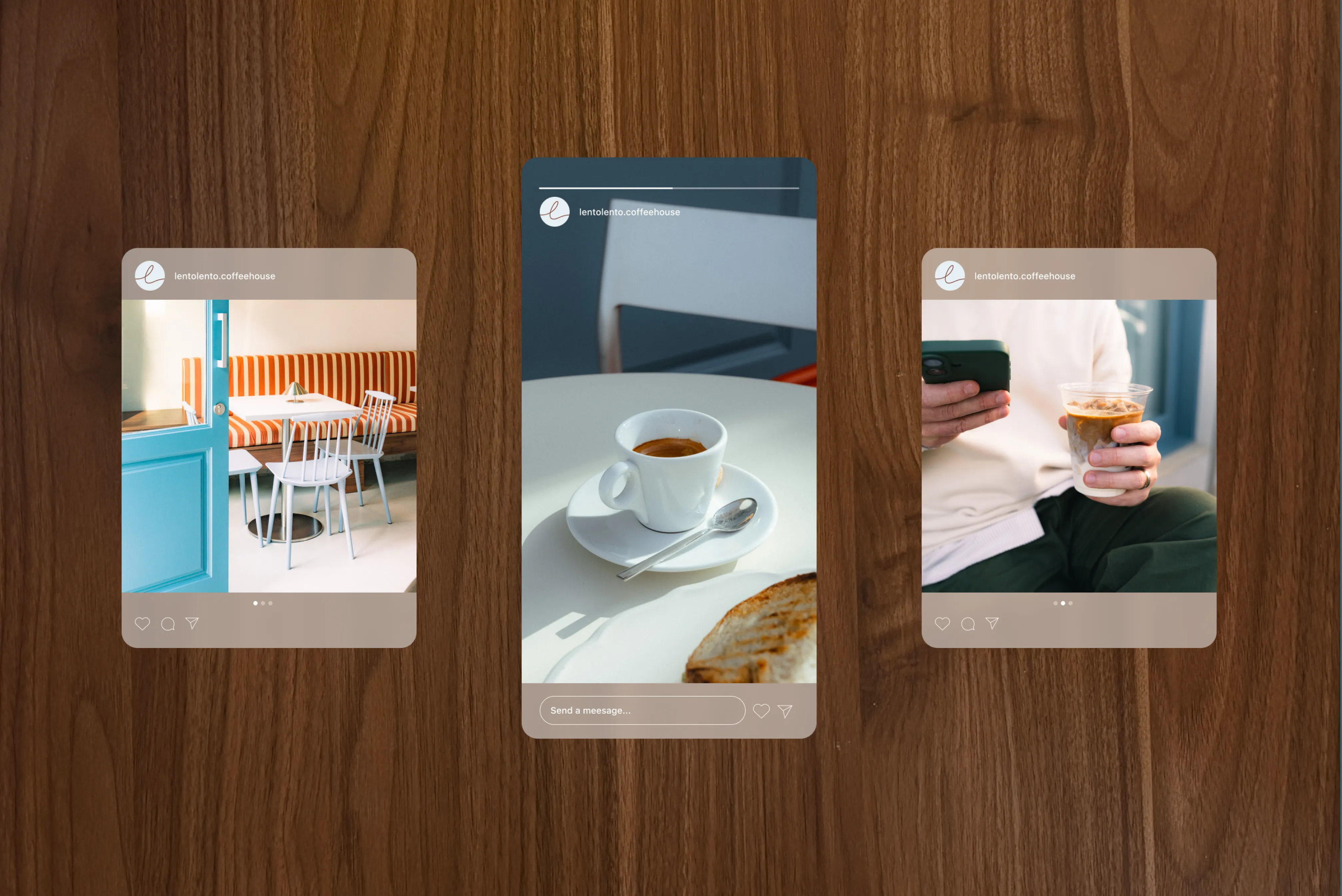
Layered menu boards invite customers to journey through a series of calming messages and photos before arriving at the menu list. This emphasis on slowing down extends across other brand touchpoints, with messages like Savour the slow and Sip at your own pace reinforcing the café’s leisurely spirit.Finally, the signage takes its own typeform. As a tribute to how coffee shops branded their signage and refurbished between the 60s and 80s, we introduced exterior hanging acrylic signage that uses an 80s inspired styling. It wasn’t an uncommon sight to have mismatching signage on coffee shops, with each one representing the era that it was manufactured rather than the main visual identity. Each letterform was carefully designed using simple geometry, as is common with the interior of the café — spherical light pendants, large round tables, round-edged stools. It wasn’t an uncommon sight to have mismatching signage on coffee shops, with each one representing the era that it was manufactured rather than the main visual identity. Each letterform was carefully designed using simple geometry, as is common with the interior of the café — spherical light pendants, large round tables, round-edged stools.
Lento Lento every momento

Tile by tile
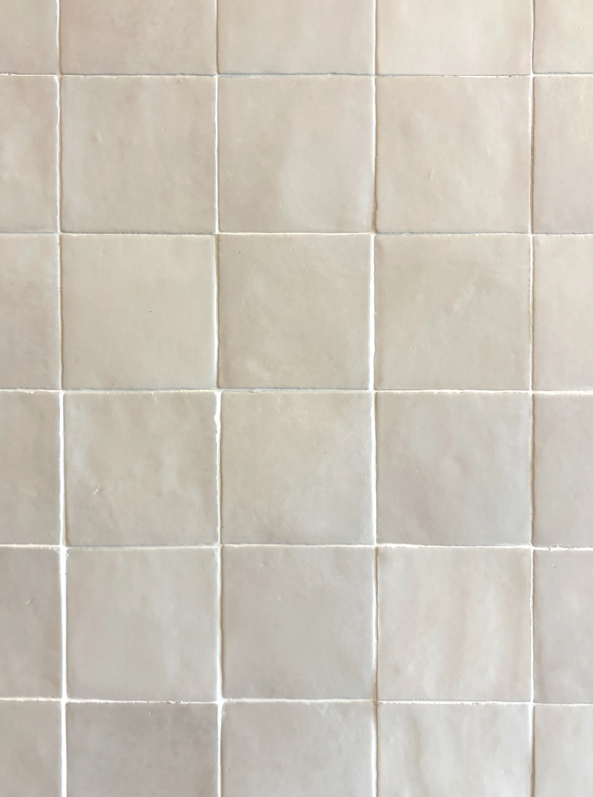
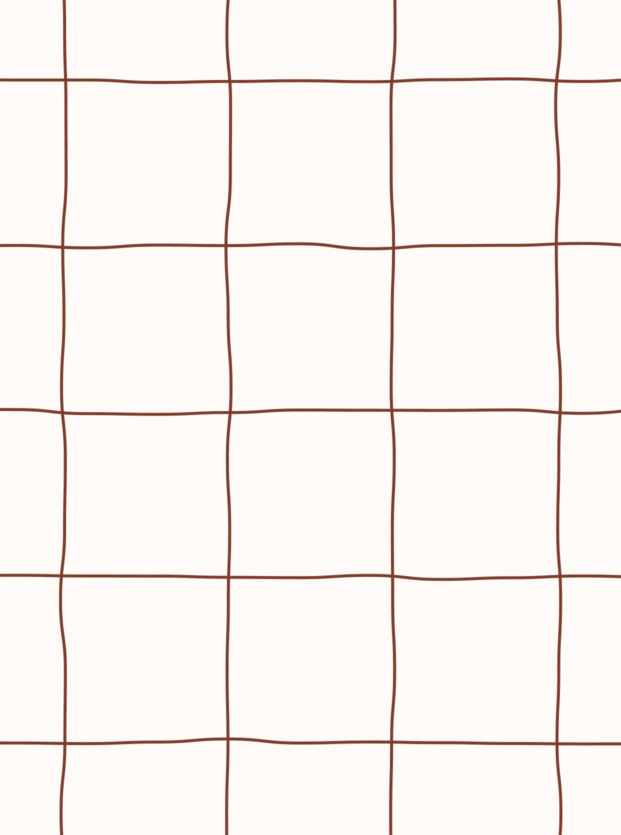
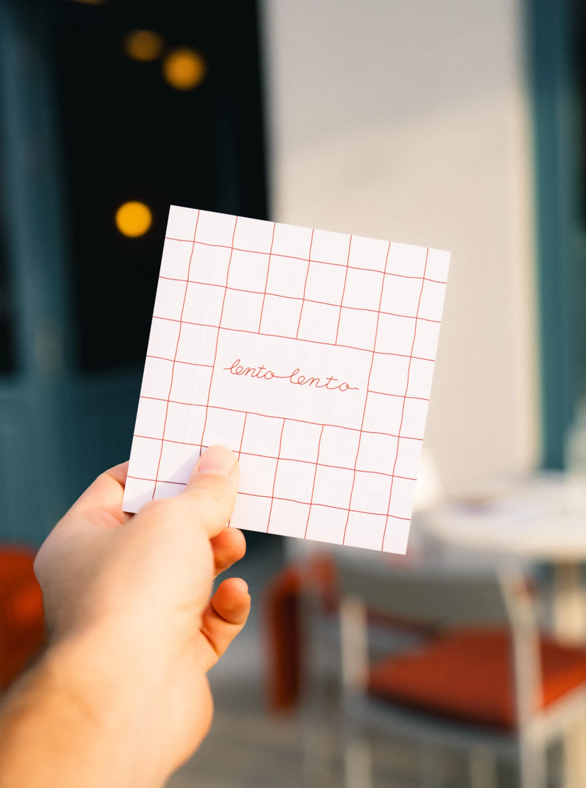
We designed a repeated pattern that takes inspiration from the tiles used in cladding the coffee shop counter.
Outcome
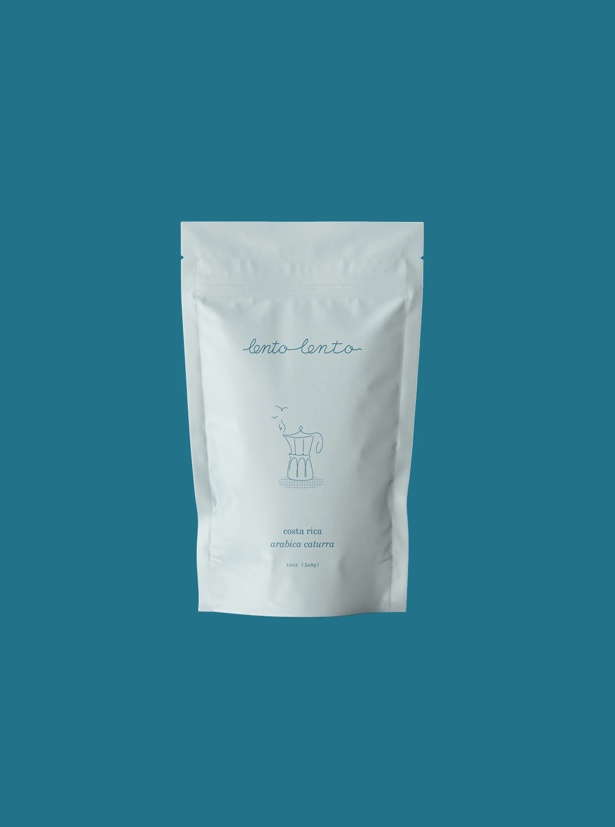
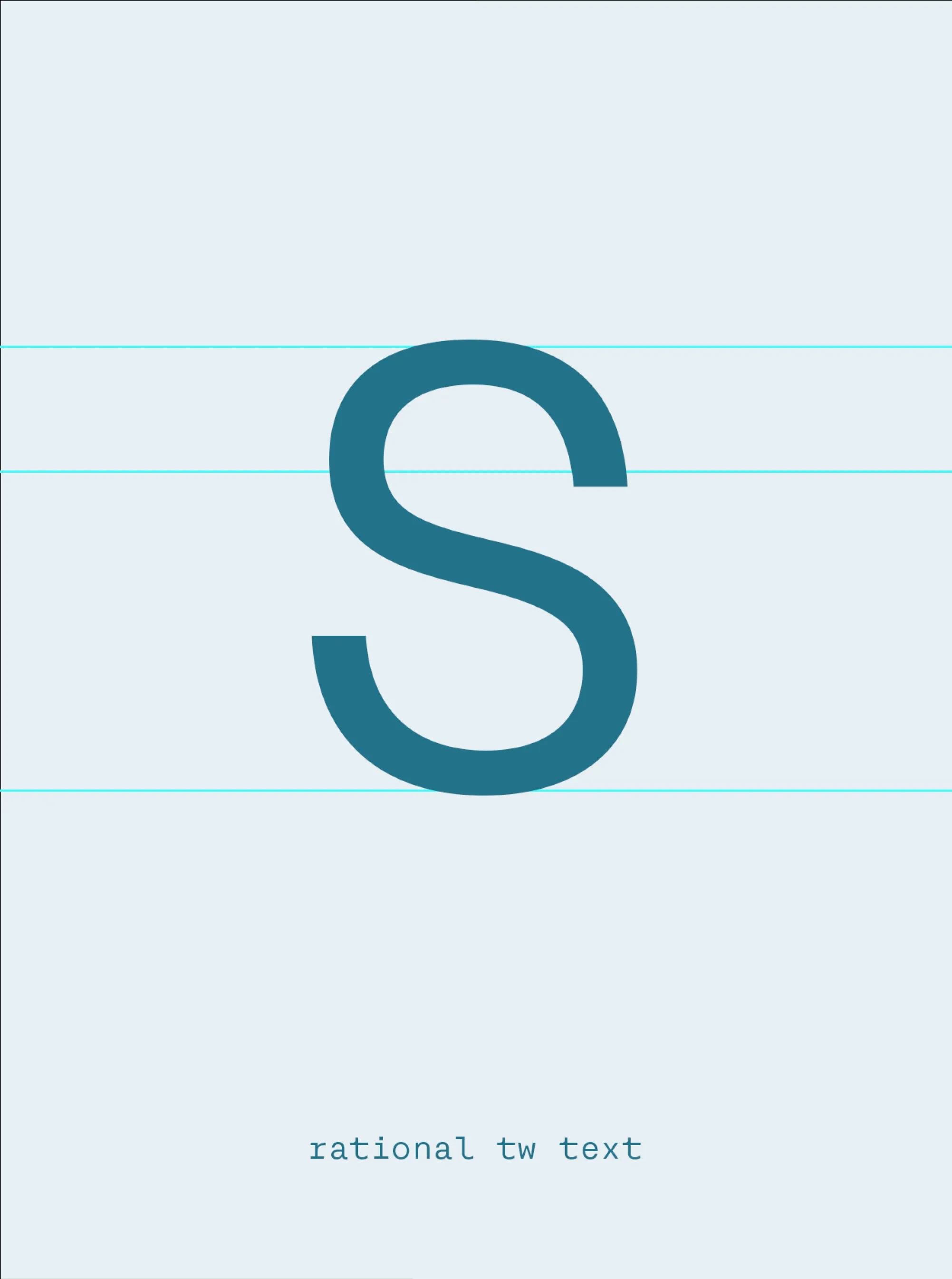
The logotype reflects this sense of slowness. Our design team developed a script typeface — one that shows movement through joined letterforms. As it reads from left to right, the spacing between letters gradually increases, symbolising a slowing down pace. This logotype was paired with line illustrations and a roughly drawn checkered pattern which was informed by the interior — more specifically, the Zellige tiles that clad the counter. While the logotype takes cues from period signage, while the menu design recalls a time when menus were typed on typewriters — when a slower pace was the norm. We chose Rational TW Text for its typewriter-inspired design, enhancing the vintage feel by using a single font style, weight, and size, just as a typewriter would.
Commonly RareDemocratizing luxury, redefining rare.


